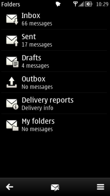
Selection list
A selection list is a common means of displaying and accessing data in applications. When a selection list is displayed, the application is typically in a permanent state, which means that the user can leave the application, open another application, and later return to the same state. Selection lists are displayed in the main pane.
Typically, the user can open items in a selection list, leading into another, more detailed view of the item within the application. In addition to browsing and selecting items, other functions are available in the Options menu (see Options menu).
Use of the Selection key in selection lists deserves special attention. Depending on the situation, it performs the following actions:
Selects the item in focus. This should always happen whenever the consequences of making a selection are clear to the user.
Opens the context-sensitive Options menu. This should only happen when the user cannot be assumed to know what happens if the Selection key is pressed. The menu should contain only high-priority options associated with the item in focus, not general items such as Settings, Help, or Exit. The maximum number of options in the context-sensitive Options menu is four.
The two types of Selection key actions should not be mixed within one list; one or the other should happen for every item in the list.
The keypad functions for selection lists are as follows:
Key events |
Description |
|---|---|
Arrow up / Arrow down |
Moves the focus in the list. |
Arrow left / Arrow right |
May be ignored, or may have navigation functions associated with them. |
Selection |
Selects the item in focus. |
Clear |
Deletes the item if it can be deleted (confirmation from the user is required); otherwise ignored. |
Numeric keypad |
May be ignored, or may have specific functions within the state. |
Other keys |
Do the default action of the key. |

Figure: Selection lists
Using selection lists in applications
The API to use for selection lists is the Lists API. For implementation information, see Using the Lists API.