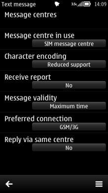
Setting list
A setting list is a specific kind of selection list containing setting items that the user can adjust. Setting lists are displayed in the main pane.

Figure: Setting list
A setting item can be adjusted by selecting it in the same way that selection list items are selected. That is, by pressing the Selection key or tapping in the touch UI. The main pane then displays the setting item editor where the value can be changed.
There are several setting item types available. They look the same in the setting list — each item displays an attribute text (the title of the setting) on one line and the current value on another line within the item. The adjusting and editing functions differ between setting item types.
| Setting | Description |
|---|---|
Pop-up |
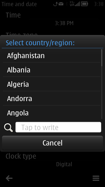
A pop-up setting allows the user to choose one value from a predefined list. The setting editor displays the available values in a menu list. A pop-up setting may also allow the user to enter a new textual value in addition to the predefined values. In that case, the last option is named Other (or equivalent), and selecting it opens a Data query for entering the new value. |
Multi-selection list |
A multi-selection list setting allows the user to choose several simultaneous values from a pre-defined list. The setting editor displays the available values as a multi-selection list. The setting item displays the number of selected items versus all the items in the value field; for example: 3/8. |
Text |
The value of a text setting item is an alphanumeric or numeric string. The editor can be of a specific type, such as the Date and Time editor. |
Slider |
With a slider, the user can adjust the value of a setting by sliding a marker. The value of a slider is adjusted using the Arrow left and Arrow right keys. |

Figure: Pop-up setting
Figure: Text setting
By default, in a setting editor, the keypad functions are as follows:
| Key | Action |
|---|---|
Arrow up / Arrow down |
|
Arrow left / Arrow right |
|
Selection |
|
Clear |
|
Numeric keypad |
|
Other keys |
Does the default action of the key. |
In the setting editor, the Navi pane is empty, or in case of a text editor, contains the editing indicators.
Further guidelines:
Typically, a setting list is accessed via the Options menu (see Options menu).
Setting lists can only contain setting items, not other types of items mixed with them. (In case the settings are arranged in a hierarchical structure, both setting items and setting folders may exist in one list.)
All the setting item types can coexist in the same setting list.
If a pop-up setting has only two available values (such as On and Off) and no special procedure is needed when switching from one value to the other, then the setting editor (list) must not be displayed when the user presses the Selection key or taps the item to change the value. The item's value is changed immediately. However, if the user opens the setting item via the Options menu, or if an additional procedure is required (for example a password) before the item's value can be changed, the list is opened normally.
Using setting lists in applications
The APIs to use for setting lists are the Lists API and the Setting pages API. For implementation information, see Using the Lists API and Using the Setting pages API.