Form
If a MIDlet requires having multiple UI components on the screen
at the same time, they can be implemented using Forms. In a similar way to other high-level
APIs, Forms also take up the whole display area
but in that area they can contain a number of different UI elements,
such as sliders, pop-up lists and text fields. Forms offer a way to handle data and user input in a more complex way.
All Form elements are derived from the superclass Item. The Form Items are presented in the main pane, which can be scrolled
vertically if all the components do not fit otherwise. Text is wrapped
and images are clipped if the content exceeds the horizontal space.
Items are laid out to the main pane from top to bottom and left to
right, by default. An Item is focused when
the user has navigated to it using the arrow keys and a highlight
box indicates the Item has been focused on. Items can be editable or non-editable. All Items have a label, which is null by default. If
an item has a label, it is displayed on a line below the rest of the
item.
All editing in a Form takes place inline and
all editable Items are focusable. Also the non-editable Items StringItem and ImageItem can be focusable if there are one or more Commands set to them and ItemCommandListener is registered. CustomItem is focusable if its traverse method returns
true.
In Form navigation, the Arrow up and Arrow
down keys move the focus, scroll form, or do both. The key behavior
(the Selection key, the Arrow left and Arrow right keys) on a focused
item varies from component to component. Form navigation does not
loop.
Forms can contain the following Items:
Empty Forms (Forms with
no Items) are presented with the text no data.
The layout of Items within a Form is organized around rows. The maximum width of all rows within a Form is the same and does not vary based on the Items contained within the Form.
If a Form exceeds the height of the screen it
grows vertically and vertical scrolling is used by the user to view
further content. If the content exceeds the screen width, it is either
wrapped (text) or cropped (images) to the available space.
The height of the rows can vary depending on the Items positioned in the row. If the first / last Item in a Form is a Spacer larger
than the size of the screen then as much of the Spacer as necessary is ignored in order to start or end the Form with the first or last visible Item being completely
in view.
Focus traversal and editing
| Item |
Key event |
Behavior |
|---|---|---|
|
|
Up, down, left, right arrow keys |
Moves cursor in editor.
|
| Interactive |
Left, right arrow keys |
Modifies |
| Interactive |
Up, down keys |
Does focus traversal out of the |
|
|
Left, right arrow keys |
Changes between
|
|
|
Up, down keys |
Does focus traversal out of the
|
|
|
Left, right arrow keys |
Do not move focus at all. |
|
|
Up, down arrow keys |
Moves focus inside the |
For information about supported new line character combinations, see section New line handling.
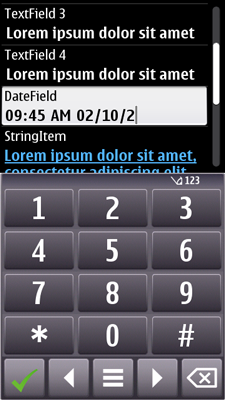
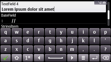
TextField and DateField support of split view input
When the user
taps on the TextField or DateField, split view input is opened. The keyboard takes screen space from Form, so Form automatically resizes
to fit the remaining area. The status pane of Form is automatically removed when split view input is opened.
Form can be used with the opened keyboard as
normal, switch to other items, scroll, edit focused item and such.
The following figures shows the split view input on Form:

Figure: Figure: Split view ITU-T input on Form in portrait

Figure: Split view QWERTY input on Form in landscape