Touch interaction in Series 40

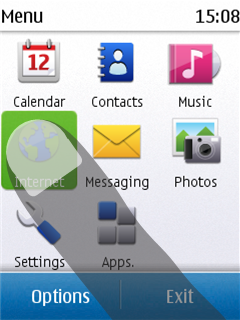
Figure: Selecting a UI component in Series 40 6th Edition FP 1
On Series 40 devices with a touch screen, touch interaction is supported by all LCDUI components.
High-level LCDUI components use the predefined touch implementation provided by the device, so you do not need to separately program touch interaction for them. The device platform defines how these components look and behave.
Low-level LCDUI components do not automatically implement touch functionality. Instead, you need to separately listen for and handle touch events for these components. You can handle touch events using:
The Gesture API classes and methods provide a ready-made touch event implementation for a wide range of use cases, allowing you to focus on the look and feel of the MIDlet UI, while leaving the complexities of gesture recognition to the API. The Gesture API is included in the Nokia UI API.
You can use the Gesture API together with the Frame Animator API to create linear drag and kinetic scroll animations in response to drag and flick gestures.
The pointer event methods only notify the MIDlet when basic touch events occur. If you use these methods, you need to separately implement gesture recognition in the MIDlet.
Series 40 touch platform
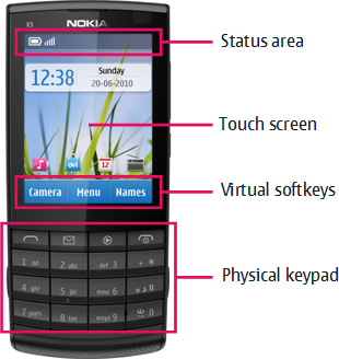
Series 40 touch devices include both a touch screen and a physical keypad:
The keypad contains the standard numeric keys, the call key, and the end call key.
The navigation keys are not included, since UI navigation relies on touch input.
The physical softkeys are replaced by virtual softkeys shown at the bottom of the touch screen. The virtual softkeys are sized so they can be used with the thumb of the hand holding the device.
Most components on the screen respond to touch. The only exceptions are the status area at the top of the screen and the scrollbar, both of which are for information purposes only and therefore non-interactive.

Figure: Main UI components of a Series 40 touch device
The Series 40 touch UI uses single tap for interacting with UI components. To select a UI component, the user taps it once. No separate tap is required to first focus the component. High-level LCDUI components automatically follow this behavior. If you want to use this same behavior for low-level LCDUI components, you need to implement it for them separately.
Components on the screen do
not have a permanent highlight. Instead, a component is briefly highlighted
when tapped. While selected, an editable Form Item displays a border around its value area and one or
more input indicators specific to the Item, indicating
that the Item is active and its contents can be edited.
To avoid the passive feeling of touch screens, the Series 40 touch UI supports tactile feedback.
More information
For more information about touch interaction in the Series 40 platform, see:
Using gestures for instructions on how to use the Gesture API to implement touch functionality
Creating drag and scroll animations for instructions on how to use the FrameAnimator API to create linear drag and kinetic scroll animations in response to drag and flick gestures
Touch UI - FavoriteArtists for an example MIDlet that shows you how to use the Gesture API and FrameAnimator API
Setting the editing style for Form Items for instructions on how to change the editor UI used for editable
Form ItemsSeries 40 Touch and Type UI Style Guide for an overview of the Series 40 touch UI