Scalability
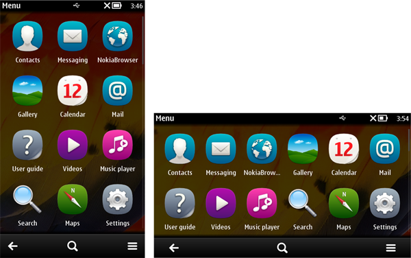
Mobile devices have different display resolutions. The trend towards larger resolutions and also different resolutions within one device, namely portrait and landscape modes, can pose compatibility and performance problems with MIDlets designed for the earlier fixed and smaller resolutions. The term scalability refers to the ability of an application UI to function as designed in mobile devices with different screen resolutions and orientation modes. For example, in the following figure, the UI scales to fit both the portrait and landscape modes.

Figure: Portrait and landscape displays
On Symbian devices, high-level UI elements are scaled automatically
based on screen resolution and device orientation. If a MIDlet sets
the preferred sizes for Form items, these items
may need to be scaled manually for different resolutions. The device
platform sends a notification (by calling the Displayable.sizeChanged method) when the drawable area changes. Low-level UI elements require
you to implement any scaling functionality manually. On Series 40
devices, use the Orientation API to change the MIDlet UI orientation between
portrait and landscape modes.
From S60 5th Edition onwards, it is also possible to force the
MIDlet into either the portrait or landscape mode by using the Nokia-MIDlet-App-Orientation JAD attribute.
For more information about scaling UI elements, see section Graphics scaling for Canvas in this library and section Scalable UI in the Design and User Experience Library.