UI elements and controls
The user interface (UI) of Series 40 and Symbian devices consists of at least one display and optionally physical keys for the user to enter input and interact with applications. The size and resolution of the displays varies among devices, as do the keys available for input. On touch devices, the touch screen serves as the primary means of user input and interaction.
User input
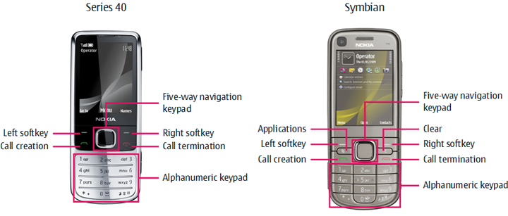
The following figure shows the common input keys on non-touch devices.

Figure: Common input keys on non-touch devices
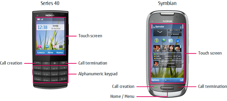
The following figure shows the common input keys on touch devices. On Symbian touch devices, the touch screen itself provides the primary means of input, while Series 40 touch devices retain the alphanumeric keypad for text and number input. The physical softkeys are replaced by virtual softkeys shown at the bottom of the touch screen.

Figure: Common input keys on touch devices
In addition to the common input keys, Series 40 and Symbian devices can include a number of extra keys for different purposes, such as:
Camera key
Edit key
Keyguard switch
Media keys
Middle softkey (some Series 40 devices)
Messaging key
Power key
Volume keys
Devices can also include a QWERTY keyboard, a 9-way navigation mechanism, and other more advanced keys.
The specific set of keys depends on the platform and the device. To find out which keys are included in a particular device, see Nokia Developer device specifications.
For more information about the touch UI, see section Touch UI in this library and document Series 40 Touch and Type UI Style Guide on Nokia Developer.
Display
The device display consists of the following elements:
Screen
The screen corresponds to the entire pixel area of the physical display.
Window
A window is a visual area on the screen. A window can take up the entire screen, or it can take up only a portion of the screen, in which case it usually includes a frame to indicate its area and borders. For example, pop-up windows only cover a portion of the screen, include a frame, and leave the underlying window partly visible in the background.
Each application runs in its own window.
Pane
A pane is a subcomponent of a window that is dedicated to a specific purpose. A window can contain multiple panes, and panes can contain subpanes.
Application window
An application window is a principal window taking up the entire screen. It is usually not used directly for displaying content, but rather as a parent for the various panes. For more information about application window panes, see the following section.
Application window panes
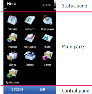
The following figure shows the typical panes of an application window.

Figure: Application window panes
Each application window pane has a specific function:
Status pane
The status pane displays information about the current application and its state, as well as general information about the device status, such as signal and battery strength. By default, the status pane occupies the top part of the application window.
Main pane
The main pane is the principal area of the screen where applications are drawn and where they can display their data. By default, the main pane occupies the large middle part of the application window.
Control pane
The control pane displays the labels associated with the softkeys. On touch devices, the labels function as the softkeys. The control pane also displays command menus associated with the softkeys. By default, the control pane occupies the bottom part of the application window.
The control pane allows device users to navigate between the different views and states of an application.
More information
For more information about UI elements, see the following documents:
Series 40 UI Style Guides for information about Series 40 UIs
Symbian^3 UI Style Guide for information about the Symbian^3 UI
S60 3rd Edition FP2 UI Style Guide for information about the S60 3rd Edition FP2 UI
S60 UI Style Guide for information about earlier Symbian UIs
Design and User Experience Library for information about UI design and usability
User Experience Checklist for Keypad and User Experience Checklist for Touch for the most important usability guidelines for ensuring good user experience