Category bar
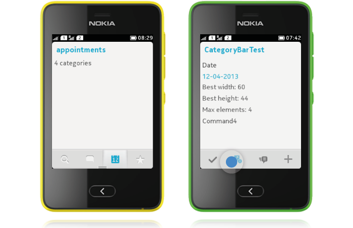
CategoryBar is a Nokia UI API that now has two modes. It can be used as a tab bar or as a toolbar. It is always placed at the bottom of the view. The tab bar functionality enables easy navigation between parallel views, whereas the toolbar functionality provides access to 1-4 primary actions of the view.

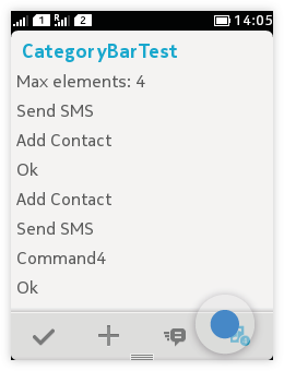
Every CategoryBar element is visually represented by an icon image. In STAY_SELECTED mode there is always one element with a selected appearance, indicating to the user which application or view is active. Actions should not be placed to the CategoryBar in STAY_SELECTED mode. In RELEASE_SELECTED mode the icon gets highlight with touch down; with touch release the highlight disappears and the action is triggered.
Tab bar functionality
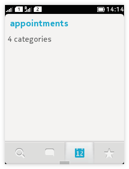
Sometimes there are more functionalities than can comfortably fit into one screen. In such cases it should be easy to navigate between the related functionalities, such as making a call by different means (using contacts list or by dialling), without navigating a deep menu tree of separated apps. Also, there might be more modes or views of the same application, when navigation between them needs to be simple.

- The ELEMENT_MODE_STAY_SELECTED mode may be used to allow visibility and navigation between:
- Parallel views,
- functionalities, or
- modes within an app.
- CategoryBar uses IconCommands.
- Category bar is level contextual; it should disappear when user drills down, or be replaced with a new category bar.
- Category bar functionality can be compared to tabs.
- Category bar always appears at the bottom of the screen.
- The minimum number of categories to use is two; if only one would be defined, there would not be a view to change into and obviously not really a need for the Category bar.
- The maximum number of categories is four; if more are defined, they will not be shown anywhere.
- Users change the active category by tapping on the category icon.
- Currently active category is highlighted.
- Pressing the back key does not switch between tabs; if the user opens a new tab and then presses back, the tabbed view will be exited.
- The Displayable title of each category should properly describe the function of the view.
- Horizontal scrolling should not be used in views with a category bar; the primary scrolling direction is vertical.
Toolbar functionality
If you have multiple important actions you wish to show on the screen (not in the Options menu), use the CategoryBar's toolbar functionality. You can use the CategoryBar as a toolbar by choosing ELEMENT_MODE_RELEASE_SELECTED mode. Then all elements are stateless and selected appearance is only shown during element selection. This mode should not be used for parallel view navigation.
 |
|