Lists and grids
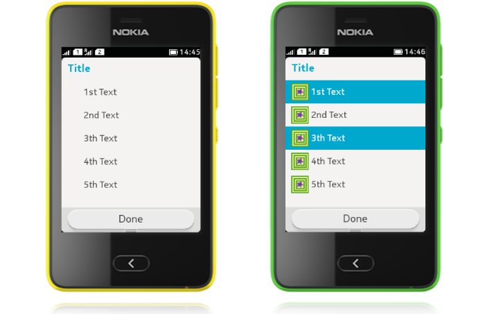
LCDUI Lists contain one row textual items, with optional additional icons. In general, informative icons should be displayed to the left of the text. The icon positions are mirrored for right-to-left languages. You can only use one list item type (IMPLICIT, MULTIPLE, EXCLUSIVE) for each list.
For grid layout, there is a template in the SDK.
Implicit list
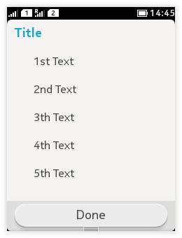 |
List.IMPLICIT:
|
Multiple selection list
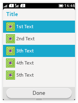
List.MULTIPLE:
- Short item title is recommended.
- Text wrapping and truncation is supported for the item titles.
- Selected items have a highlight over the entire line; no check boxes are used.
- Tapping on an item toggles the state of selection.
- Ensure that there is a way to confirm the selection, e.g. with 'Done' Command.
Exclusive selection list
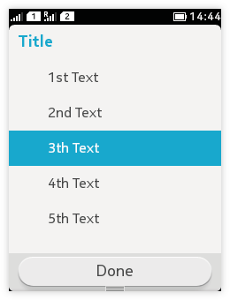 |
List.EXCLUSIVE:
|
Grid layout
You can create grid layout with the Grid UI template found from the SDK.