Menus (Options lists)
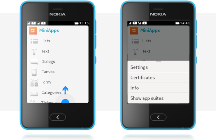
Options list, opened by swiping from the bottom of the view, contains actions that should apply to the entire view. Context menu, opened with a long press on a specific item, contains actions that should apply only to that specific item. Command labels are shown as one row text items in both menus.

Options list
- An Options list indicator is shown when the list is available.
- Tapping on the indicator gives assistive motion effect that helps the users to detect that swiping should be used to open the Options.
- Opens by swiping up from the bottom of the view.
- Closes by selecting an item, tapping outside the list, flicking the menu down, or by pressing the Back key.
When Options are open, the whole content area in the background is dimmed. Command labels in lists are always one row.

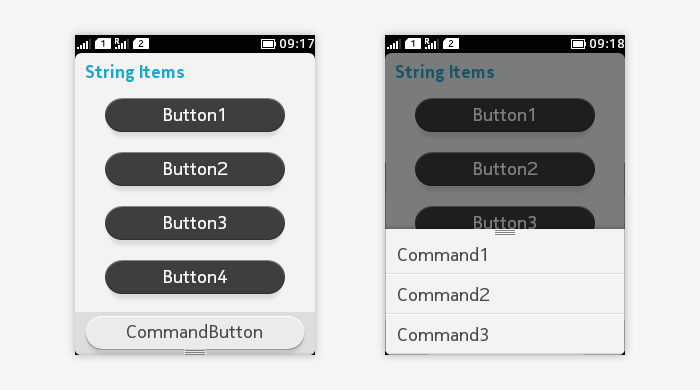
Options menu contains global Commands for that state. The order of the items is defined by Command priority number.
- The highest priority Command is mapped to the bottom of the view as a textual Command button.
- Other Commands are mapped to the Options menu in priority order:
- The most frequently used actions should be put at the top of the list, i.e. they should have higher priority.
- The less frequently used actions should be put at the end of the list, i.e. they should have lower priority.
If no Commands are defined for the view, the indicator for the menu is not shown, and swiping from the bottom of the view does not cause any action.
When there are more items than fit to the options list window, to hint that the menu is scrollable, the last item of the list is partially cut. While scrolling, a scroll bar fades in to indicate the length of the list. Even though Options lists can be scrolled, it is recommended to avoid overloading.
Context menu
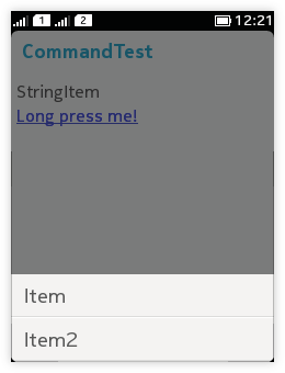
When a user performs long press on an item, a context menu opens (in case ITEM Commands have been defined for that item).
- Displays Command labels in a list that opens from the bottom of the view (similarly to the Options list).
- The Commands apply only to the specific item on which the long press was done.
- While the context menu is open, the content area background is dimmed.
- The menu closes by selecting an item or tapping outside the list.
 A single tap action for an object should not be duplicated in its context menu. For example, if single tap on the item opens it in a new view, the context menu should not contain action 'Open' and duplicate the functionality.
Context menus should not be the only means of activating an action, because they are less discoverable than on-screen buttons or the Options list, and they may not be found by all users. Therefore, it is recommended that the actions in the context menu are also made available in the next state down in the navigation hierarchy (for example, in the normal Options list). Because of this duplication, using the context menu is considered a shortcut for going to the next screen and performing the operation there.
Command types
| MIDP command type | Intent of command |
|---|---|
| STOP | Stop currently running process or operation. |
| OK | Standard positive response to a dialog on the display. |
| CANCEL | Standard negative response to a dialog on the display. |
| ITEM | A command defined by the MIDlet, relates to a specific item on the display. |
| SCREEN | A command defined by the MIDlet, relates to the current display. |
| HELP | Request for MIDlet's help information. |
| BACK | Navigation command for returning to the logically previous place. |
| EXIT | Exit the MIDlet. |