Lists
Lists are combinations of text, thumbnails and controls. List view is a dynamic UI component of list items displayed vertically in multiple rows layout. For right-to-left languages, the position of icons and thumbnails is mirrored.
List automatically becomes scrollable if it contains more list items that can be fitted to the view. With touch down a highlight is shown to the list item. With touch release, the highlight disappears and the action is triggered.
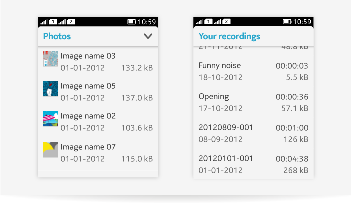
List layouts
Lists are used for:
- Presenting content items in list views
- Enabling drill down navigation
- Invoking actions, for example opening another app.
| Element name | Description and recommended placing |
|---|---|
| Primary text | Shows the most primary and important content of the item. In most cases, it is the first line of the item, in some cases it can be the second line of the item. |
| Subtext | Detailed information of the item or discription of the primary text. |
| Timestamp | Always shown on top right corner of the list item. |
| Information | Shows duration, price or size for the item. Always on bottom right corner. |
| Thumbnail | Located on the left-hand side. Can also include informative icon instead of thumbnail image. |
| Icons | 1-3 indicator icons show on bottom right corner, e.g. SIM card indicator, attachment or favorite. |
| Action button | Can be used in list items, controls are always placed to be justified to the right end of the item. |
| Spinner | Can be shown on the right-hand side if needed. |
| Progress bar | Can be shown, for example, when installing an app. Cancel button can be used to dismiss the progress if needed. |
Standard list item layouts:
- One to two rows
- With or without an icon
- Thumbnails possible
- With or without the controls.
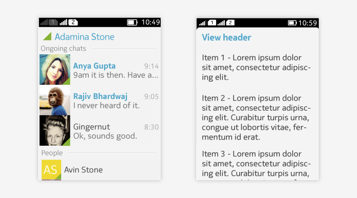
- Truncation is possible (note: truncation in list items is currently done with three dots '...'. Fading out of text is recommended over usage of three dots, but has to be implemented as a custom solution).
- Text wrapping for list items is not supported on LWUIT Lists, but it can be implemented using LWUIT Forms.
- Use TextArea components.
- Place TextArea components inside Containers stacked in a Form.
- Use group headings to index larger data sets (e.g. a set of events can be divided to day chunks based on chronological order).
Below are examples of different list layouts.
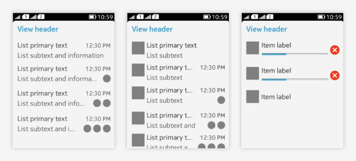
Implicit list
Implicit list is used for
- Presenting content items in list views
- Enabling drill down navigation
- Invoking actions, for example opening another app.
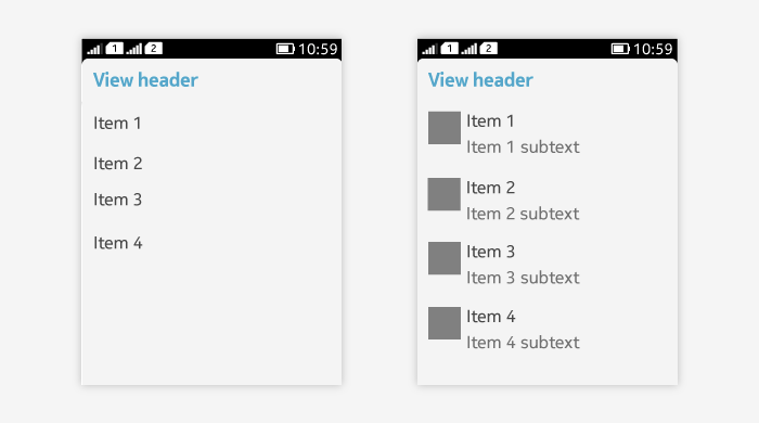
Below are examples of LWUIT implicit list.
Below are the examples of LWUIT implicit list with truncation and wrapping.
Exclusive list (Single selection list)
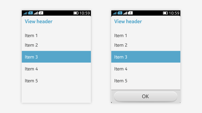
Exclusive list item layout:
- Short item title is recommended.
- One to two rows
- Thumbnails are possible
- Truncation is possible
- Wrapping is not supported, but can be done using a custom component.
- For performing single selection.
- Selected item has a highlight over the entire line, note that no radio buttons are used.
- Tapping on another item removes the previous selection.
- When necessary, add an "OK" button to confirm the selection.
Multiple selection list
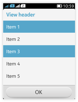 Multiple selection list item layout:
- Short item title is recommended.
- One to two rows
- Thumbnails are possible
- Truncation is possible
- Wrapping is not supported, but can be done using a custom component.
- For performing multiple selection.
- Selected items have a highlight over the entire line, note that no check boxes are used.
- Tapping on the item toggles the state of the selection.
- Ensure that there is a way to confirm the selection, e.g. with "OK" command.
Guidelines
- Normally list items in one list view follow the same layout. Mixing different list items needs careful consideration.
- Make sure to also design the empty list experience. See the Empty states pattern for detailed guidelines.