Sliders
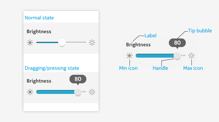
Lets the user select a value from a range of values by dragging a graphical handle between predefined end points. The range of values is represented as a line. In addition to dragging, use of tap gesture is also supported. Sliders are typically used in settings and for controlling a music track or video playback.

Slider elements
| Element | Description |
|---|---|
| Label | A title of the slider, for example the name of the setting – "Brightness". Label is optional. |
| Track | A line that represents a full range of values from minimum to maximum. Track has a fill that goes from left end to the handle. The number of steps between the end points on the left and on the right can be defined per application. |
| Handle | The interactive element on the track used for changing values. Its position on the track indicates the current value. The handle moves from left to right when the value increases. |
| Min and max icons | These icons indicate visually the value of minimum and maximum setting. Use of the min and max icons are optional. Note: min/max icons are not part of the LWUIT slider component, but can be added easily. |
| Min and max labels | These labels indicate textually the value of minimum and maximum setting. Use of min and max labels are optional. Min and max icons and labels are not used at the same time. Note: min/max labels are not part of the LWUIT slider component, but can be added easily. |
Usage:
- The value of the slider can be adjusted by:
- Dragging the handle.
- Tapping either side of the handle. This moves the handle directly to the point that was tapped. If the direct point is between two values, the handle snaps to the closest value .
- Do not use a slider if the setting has only 2 values: sliders are best suited for controls with multiple values, for example adjusting a brightness level.
- Slider can also be used for zooming in cases where touch gestures do not provide enough accuracy. Using a slider can, in such cases, provide the only or an alternative mean of zooming.
Guidelines
- Use a slider when you need a fine-grained control – for example, for adjusting brightness or seeking the desired scene in a video.
- Slider should be used only if values have a set minimum and maximum and the range can be intuitively represented as a line.
- Slider is useful in situations where immediate response for the value change is needed and adjusting value by other means (for example, typing a numeric value to a field) would be excessively slow.
- Slider can be used for zooming instead of/in addition to gestures when gestures do not provide good enough accuracy.
- The granularity of the setting (i.e., the number of steps between the end points) is determined by the app where a slider is used.