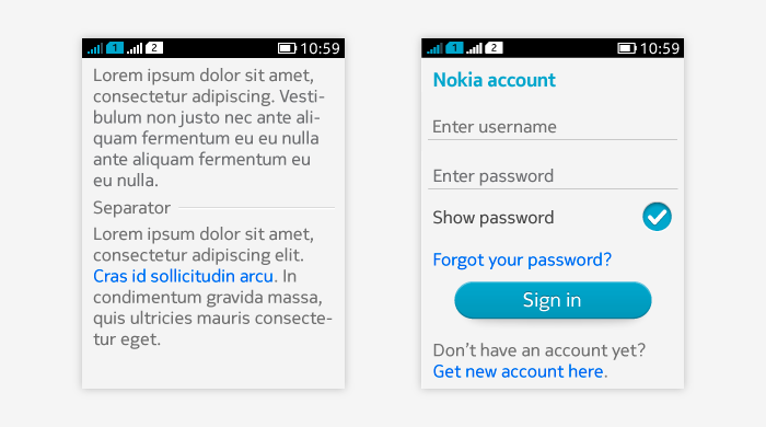
Text fields
Enables users to type in text. Contains single line or multi-line of input. Application defines how long input the user is able to enter in the text field.
Used in situations where users can enter or edit text in:
- Form.
- Message editor.
- Single items (e.g. Bluetooth device name input).
- Sign-in screens.
Non-editable texts are called body text and can be used, for example, for displaying help texts to the user.
Text Area
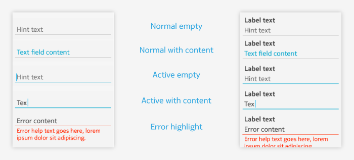
For entering or editing text. Three possible modes:
- Normal: used when text field is not active and it is just displaying its current content or placeholder text.
- Active: used when text field is focused, regardless of whether the text field has content or not.
- Error: used when it has been detected that the field contains incorrect value.
TextArea can contain:
- Labels
- Typically used in Forms; see Designing forms guideline for more information.
- On-screen keyboard
- When on-screen keyboard is invoked, its content depends on the needs of the text area – what input it allows or defaults to.
- The text area gives parameters for which keyboard is activated – e.g., numeric or alphanumeric.
- Placeholder (hint) text
- Visible when the text area mode is empty or active (without input).
- Disappears once the user enters any text into the text area.
- Reappears only after the user has totally cleared the text area content.
- In some contexts, like forms, the use of the placeholder text makes it possible to leave out the field label, as the placeholder text can instruct the user what field is in question.
- It should be taken care of that also after giving input, it is clear to the user what the field is used for. If this is not clear and users can easily get confused, it is recommended to add a label to clarify this. Typical wording of the hint text is "Add (field name)", for example "Add subject".
Activating and deactivating TextArea
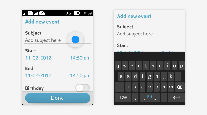
Text area is activated by tapping it.
- Activation brings up the cursor on the field, placed in the end of existing input, and visual indication is used to make the field active (e.g. underlining changes to blue).
- On-screen keyboard is opened when area is activated.
- Activation also usually positions the text area in the top part of the screen to make way for the on-screen keyboard, and to allow user to view multi-line inputs more easily above the on-screen keyboard.
- There are some exception cases when the position of the text area is not aligned on top of the display, see multi-line input. The status bar and possible header bars are removed when text area input is active.
Deactivation of the text area can be done by closing the on-screen keyboard or selecting another item on screen.
- Deactivation keeps the inputted text. User can tap the text area again to continue the inputting.
Multi-line input in Text Area
When text area supports long input areas that span to several rows, the input area is expanded dynamically.
- When text area is filled in for the first time, the cursor and insertion point moves downwards row-by-row filling the space between top of the display and on-screen keyboard.
- When the current line of the text area is aligned with the on-screen keyboard, going to the next row pushes the top of the text field outside of the display.
- Below is the typical functionality of multi-line input. In the following cases, the insertion point is aligned with on-screen keyboard also initially:
- Messaging editor where conversations are bottom aligned.
- Last field in the form.
- Single text fields, e.g. in setting items.

Masked text in TextArea
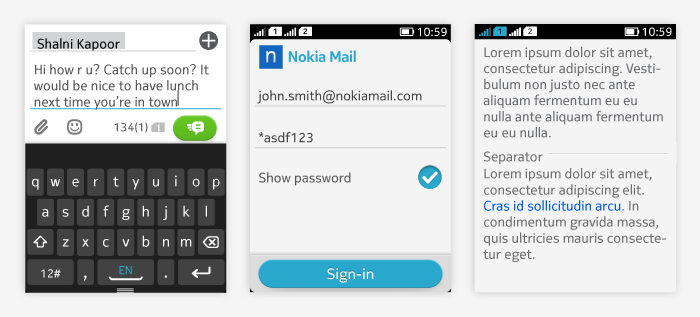
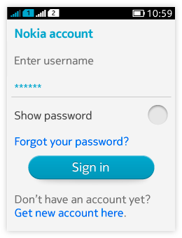 The field can be set as masked to hide a password, for example. In this case, the characters entered into the text field are shown only briefly, after which they will be replaced by dummy characters such as asterisks (*).
 - The masking functionality can have a setting for the end user to turn it on or off.
- This setting should be presented in the same screen with the text field with check box "Show password".
- Default setting for masking the text is turned off.
Text Field
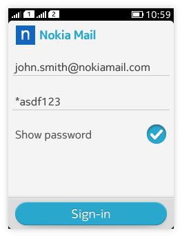 |
Text Field is a single line component. Its behaviour is similar to that of the TextArea. |
Body text (LWUIT Label)
Can be used anywhere the UI presents users non-editable text to be read. Can contain hyperlinks.
Examples of body text usage:
- Help texts – displayed for example for settings or form fields.
- End user agreement texts – can contain links for example.
- Details viewers.
Help texts
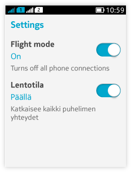 Body text chunks that are used in context with some other element, e.g. switch setting or form field.
- Added under the element that they relate to.
- When designing for several languages, keep in mind that changing the phone language can result a longer text and can reserve more lines in content area. Take this into consideration when planning the size of help text area.
- The recommended size for help text is 2 lines and recommendation is not to go over 4 lines of text in help texts.
On the right is an example of help text used for a flight setting in two different languages (in second one the same setting is in Finnish, the help text is longer).
Hyperlinks within text
Presented with blue color.
- Tapping the link typically opens the application related link (e.g. Browser).
- Pressing and holding the link has no functionality.
