Colour
This section provides detailed information about the colours used in Nokia Asha UI which might get handy in case you are creating a custom application and want to follow the platform style.
Nokia Asha colour palette
Below is the colour palette used in Nokia Asha:

Application
Choose a colour as your application personality.
- Green (R110, G182, B0) – for Phone and Call log.
- Blue (R17, G103, B191) – for Contacts, Accounts, Web, Email, Messaging, Store, Bluetooth, My apps.
- Orange (R255, G126, B0) – for Calculator, Timer, Calendar, Web Apps.
- Light grey (R236, G236, B236) – for Clock.
- Grey (R190, G196, B204) – for Camera, User Guide, and Java.
- Dark grey (R144, G154, B163) – for Settings, Sim, and Counters.
- Purple (R126, G41, B158) – for Gallery and Video.
- Pink (R212, G25, B143) – for Music, My games, Recorder, and Radio.
- Yellow (R255, G239, B89) – for Notes.
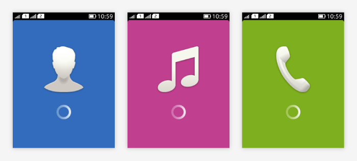
Note that the main colour used in the launcher icon could also be used as the main colour of the application splash screen.
![]()

Common background colour
The common background is light gray. Customised background colours can be used if they fit better the application colour style or for branding.
Active colour
Active colour is used to highlight elements which are selected in a view or to highlight the element user is interacting with.
For example, when the user is using the thumbler to set the date in the date picker, the "wheel" that is currently being adjusted and the corresponding date section in the date label are highlighted in blue.
