Implementation
For information about the design and functionality of the MIDlet, see section Design.
For information about the key aspects of implementing the MIDlet, see:
Button
The Button class extends CanvasGraphicsItem and defines both the controls
and appearance of a button. The Button class shows
you how to use the CanvasGraphicsItem class to encapsulate
a simple Canvas graphics control.
The Button class handles pointer events for changing between
normal (pointerReleased) and pressed (pointerPressed) states. It executes the "click" event handler passed through its
constructor when the button is released. The button can also be disabled.
CanvasTextBox
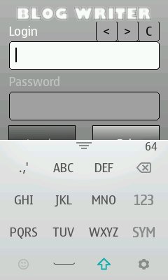
The CanvasTextBox class implements a control
with a label, text editing area, and keyboard indicator. The class
extends CanvasGraphicsItem, on which the label and
text editing area borders are drawn. Text editing is provided by a TextEditor object.
On Series 40 touch
devices, controls for moving the caret and clearing characters are
drawn above the TextEditor object.
A CanvasTextBox object can be in normal, focused, or disabled
state.
Caret controls
Series 40 touch and type devices do not support
a virtual keyboard for editing text, so the Controls class implements the following caret controls for TextEditor to ensure its usability:
Erasing a character:
int caretPosition = owner.getCaretPosition();
if (caretPosition > 0) {
    owner.delete(caretPosition - 1, 1);
    owner.setCaret(caretPosition - 1);
}
Moving the caret to the left:
int caretPosition = owner.getCaretPosition();
if (caretPosition > 0) {
    owner.setCaret(caretPosition - 1);
}
Moving the caret to the right:
int caretPosition = owner.getCaretPosition();
if (caretPosition < owner.size()) {
    owner.setCaret(caretPosition + 1);
}

Figure: Caret controls for a TextEditor on a Series 40 full touch device
Scroll bar
On Series 40 devices, using scroll bars
is not supported, since the getVisibleContentPosition method always returns 0, which means the position
of the scroll bar cannot be known, and the setCaretXY method is not supported.