CategoryBar
CategoryBar is a Series 40 full touch and
New Nokia Asha UI element typically used for switching between different
views within the same MIDlet. It allows for easy and intuitive navigation
between related functionalities. In Series 40 full touch, it is visualised
as a set of user-selectable elements, each represented by an icon
and a text label provided by the MIDlet. If there are more elements
than can fit in a single row on the screen, the device can hide the
excess elements and provide an option for the user to temporarily
expand the CategoryBar to view and access the full
set of elements (The exact behavior depends on the device, and the
MIDlet cannot affect it.). In Nokia Asha software platform devices,
It is visualised as a set of user-selectable elements, each represented
by an icon provided by the MIDlet. and IconCommand is used to place up to four icons in the CategoryBar.

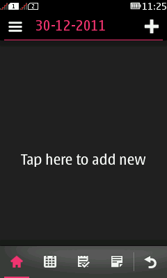
Figure: CategoryBar in Series 40 full touch with four application-defined elements and the mandatory Back button

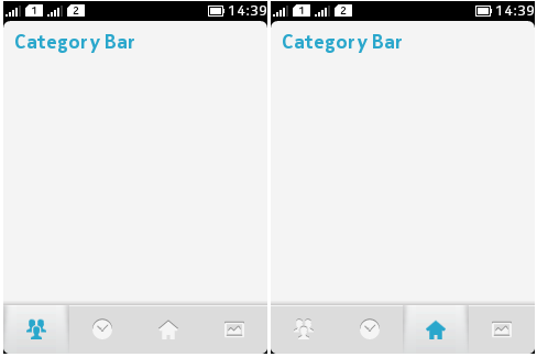
Figure: CategoryBar in Nokia Asha software platform devices with four Icons
The MIDlet is responsible for populating the CategoryBar with elements and controlling the visibility of the CategoryBar. By default, the CategoryBar is hidden. The MIDlet
must also respond to selected elements, that is, implement the actions
associated with selecting an element, typically a switch from one
view to another within the MIDlet, although other uses are also possible.
One element always has the appearance of a selected element. The MIDlet
can provide an additional icon per element to be used when the element
is selected. If the MIDlet does not provide the additional icon, the
platform uses default highlighting for the selected element. In Series
40 full touch, the CategoryBar always contains a
mandatory platform-provided Back button, mainly for hiding the CategoryBar. As a rule, when the user selects this element,
the ElementListener registered for the CategoryBar receives a notification with ElementListener.BACK as the index value of the selected element. The MIDlet is responsible
for actually hiding the CategoryBar.
For more information about handling the CategoryBar, see step 5 in Creating a CategoryBar and Hiding and showing a CategoryBar. In certain situations, the CommandListener of the current Displayable is called instead of the ElementListener; for more
information about which situations, see the ElementListener class reference.
Only one CategoryBar can be active at a time.
The active CategoryBar is the one that was last set
visible. Setting a CategoryBar visible therefore
causes it to become the active CategoryBar, replacing
and hiding any existing active CategoryBar.
The CategoryBar automatically adapts to the orientation
of the MIDlet UI. However, the MIDlet must use the Orientation API to first set the orientation.
For additional information about category bars, see the Series 40 Full Touch Design Guidelines or the Nokia Asha software platform 1.0 Design Guidelines.
Device compatibility
CategoryBar is supported
on Nokia Asha software platform devices with Java Runtime for Nokia
Asha software platform (1.0) and Series 40 full touch devices with
Java Runtime 2.0.0 for Series 40 or newer.
Creating a CategoryBar
To create a new CategoryBar:
Check the most suitable dimensions for an icon and, if you are using one, a background image using the static CategoryBar.getBestImageHeight and CategoryBar.getBestImageWidth methods. These methods return the most suitable dimensions for the current device. Use the returned values to optimise the use of icons and background image in the new
CategoryBar.The following code snippet retrieves the most suitable dimensions for a
CategoryBaricon.int bestWidth; int bestHeight; try { bestWidth = CategoryBar.getBestImageWidth(CategoryBar.IMAGE_TYPE_ICON); bestHeight = CategoryBar.getBestImageHeight(CategoryBar.IMAGE_TYPE_ICON); } catch (IllegalArgumentException iae) { // Handle IllegalArgumentException from CategoryBar.getBestImageWidth() or // CategoryBar.getBestImageHeight() }Check the maximum number of elements allowed in a
CategoryBarusing the static CategoryBar.getMaxElements. This method returns the maximum number of elements that can be displayed in aCategoryBaron the current device. Make sure your MIDlet can dynamically adjust the number of elements in the newCategoryBarto comply with the maximum value if necessary. If you try to add more elements than the maximum number, the excess elements are not displayed. (NoExceptionis thrown in this case.)The following code snippet retrieves the maximum number of
CategoryBarelements allowed on the device.int maxElements = CategoryBar.getMaxElements();
Create a new
CategoryBarobject. Use the constructor parameters to define the icons and labels for the elements with which to populate theCategoryBar. You can either define the icons and labels separately or use anIconCommandarray to provide the icon and label data. For more information about theIconCommandclass, see section IconCommand. Defining separate icons for selected elements is optional.The following code snippet creates a new
CategoryBarwith three elements using separately defined icons and labels.CategoryBar categoryBar; try { // Define the icons and labels for the CategoryBar elements Image[] unselectedIcons = { Image.createImage("Element_1_Unselected.png"), Image.createImage("Element_2_Unselected.png"), Image.createImage("Element_3_Unselected.png") }; Image[] selectedIcons = { Image.createImage("Element_1_Selected.png"), Image.createImage("Element_2_Selected.png"), Image.createImage("Element_3_Selected.png") }; String[] labels = { "Label 1", "Label 2", "Label 3" }; // Create the CategoryBar categoryBar = new CategoryBar(unselectedIcons, selectedIcons, labels); } catch (NullPointerException npe) { // Handle NullPointerException from Image.createImage() } catch (IOException ioe) { // Handle IOException from Image.createImage() } catch (IllegalArgumentException iae) { // Handle IllegalArgumentException from CategoryBar() }Configure the
CategoryBarusing the appropriateCategoryBarmethods. You can set the following additional properties not set by the constructor:Background color (only available in the manufacturer and operator domains)
Tip: To remove the background color and thus restore the default background image, use the
CategoryBar.DEFAULT_BACKGROUNDconstant as the method parameter.Background image (only available in the manufacturer and operator domains)
Highlight color for selected elements
Tip: To set the default highlight color, use the
CategoryBar.DEFAULT_HIGHLIGHT_COLOURconstant as the method parameter.Whether to apply transition effects when showing or hiding the
CategoryBar
You can set the above properties at any point during the lifetime of the
CategoryBar, not just when you first create it.The following code snippet sets a background image for the new
CategoryBarand sets the second element (at index 1) as the selected element.try { categoryBar.setBackgroundImage(Image.createImage("Background.png")); categoryBar.setSelectedIndex(1); } catch (NullPointerException npe) { // Handle NullPointerException from Image.createImage() } catch (IOException ioe) { // Handle IOException from Image.createImage() } catch (SecurityException se) { // Handle SecurityException from categoryBar.setBackgroundImage() } catch (IllegalArgumentException iae) { /// Handle IllegalArgumentException from categoryBar.setSelectedIndex() }Register an
ElementListenerfor theCategoryBar. TheElementListeneris notified whenever an element is selected. Only oneElementListenercan be associated with a givenCategoryBarat a time.The following code snippet registers the current class as an
ElementListenerfor the newCategoryBar.categoryBar.setElementListener(this);
Implement the
ElementListenerregistered for theCategoryBar. TheElementListener.notifyElementSelectedmethod is called every time the user selects an element from theCategoryBar. Use this method to handle the selection action for each element, for example a switch to the corresponding MIDlet view.The following code snippet implements a
notifyElementSelectedmethod that triggers the correct action for each element in the newCategoryBar. (The implementation of theswitchToViewandtoggleVisibilitymethods is not part of this example.)public void notifyElementSelected(CategoryBar bar, int selectedIndex) { // Switch to the MIDlet view corresponding to the selected element // or hide the CategoryBar if the Back button was selected switch (selectedIndex) { case 0: switchToView(bar, 0); case 1: switchToView(bar, 1); case 2: switchToView(bar, 2); case ElementListener.BACK: toggleVisibility(bar, false); } }After you have created and configured the
CategoryBarand set up anElementListenerfor it, show theCategoryBarin the MIDlet UI so that the user can access it. Use thesetVisibilitymethod as follows:categoryBar.setVisibility(true);
You have now created the CategoryBar.
Retrieving the properties of a CategoryBar
You can retrieve the following
properties from an existing CategoryBar:
Default bounding box, that is, the smallest inclusive rectangle that encompasses all of the pixels of the visible
CategoryBar
Setting the properties of a CategoryBar element
You can set the
following properties for an element of an existing CategoryBar:
Unselected icon
Selected icon
Label (in Series 40 full touch)
Typically, you set the above properties before displaying
the CategoryBar for the first time, but you can also
set the properties at any time.
You can either define the icons and labels separately or use an IconCommand object to provide the icon and
label data.
Note: Setting the above properties overrides any values already set for the properties.
Hiding and showing a CategoryBar
If you need to hide the CategoryBar at some point in the MIDlet UI flow, call categoryBar.setVisibility(false). This removes the CategoryBar from the MIDlet UI, making it inaccessible to
the user. When you want to show it again, call categoryBar.setVisibility(true) and the CategoryBar is again displayed in the MIDlet
UI.
Note: MIDlets can modify the visibility of a CategoryBar only when running in the foreground. If a MIDlet attempts to modify
the visibility when in the background, the request is ignored. Similarly,
if the MIDlet UI is partially or completely hidden by a native UI,
any attempt to show the CategoryBar is cached until
the MIDlet is brought back to the foreground.
Differences between Series 40 full touch and Nokia Asha software platform 1.0
On Nokia Asha software platform devices, it is possible to define
the behavior of the CategoryBar’s elements when they receive touch
events. When the user taps a CategoryBar element on Series 40 full
touch, the element remains selected, meaning that any consecutive
taps on the same element, cannot be caught, because the notifyElementSelected call back method is executed only during the transition from the
unselected to the selected state. The same behavior is implemented
by default on Nokia Asha software platform devices, however it is
possible to force an element to remain unselected after being tapped,
by defining the CategoryBar’s mode to ELEMENT_MODE_RELEASE_SELECTED. When this happens, the element is briefly highlighted on touch
down and then returns back to the unselected mode, on touch release.
These are the two possible modes for the CategoryBar supported on
Nokia Asha software platform 1.0:
CategoryBar mode indicating that element should be released after element is selected.
CategoryBar mode indicating that element should stay selected after element is selected.
The methods getMode() and setMode() can be used to retrieve and set the behaviour mode of the CategoryBar
respectively. This is how the ELEMENT_MODE_RELEASED_SELECTED mode can be enabled:
categoryBar = new CategoryBar(unselectedIcons, selectedIcons, labels, CategoryBar.ELEMENT_MODE_RELEASE_SELECTED);
When the CategoryBar is set to the ELEMENT_MODE_RELEASE_SELECTED mode, the notifyElementSelected call back method is always
executed each time the user taps the same or any of the CategoryBar’s
elements.
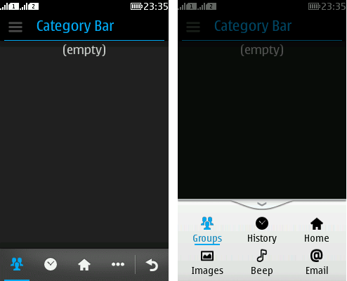
While on Nokia Asha software platform devices, there can only be 4 elements placed in the CategoryBar, on Series 40 full touch devices, there can be more than 4 (typically up to 15). When the CategoryBar on Series 40 full touch devices receives more than 4 elements, the fourth element is replaced with the three-dot expandable element, that nests all the elements that cannot be shown in the CategoryBar’s main view as shown in the Figure below:

Figure: An expandable CateogyrBar with more than 4 elements on Series 40 full touch devices
The implementation automatically handles the expansion or
retraction of the CategoryBar in this case, i.e.
there is no additional code required by the developer other than the
definition of the elements and their addition to the CategoryBar.
More information
For more information about CategoryBar see Series 40 Full Touch Design Guidelines for CategoryBar.