UI elements and controls in Nokia devices
The user interface (UI) of Series 40 and Nokia Asha software platform devices consists of at least one display and optionally physical keys for entering input and interacting with applications. The size and resolution of the displays varies among devices, as do the keys available for input. On touch devices, the touch screen serves as the primary means of user input and interaction.
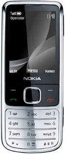
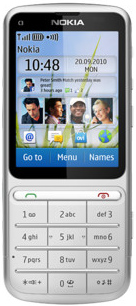
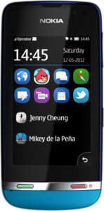
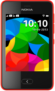
The following table shows the common input keys on various non-touch and touch enabled Series 40 and Nokia Asha software platform devices.
Series 40 non-touch |
Series 40 touch and type |
Series 40 full touch |
Nokia Asha software platform 1.0 |
|
 |
 |
 |
 |
|
Five-way navigation keypad |
x |
|||
Left and right physical softkeys |
x |
|||
Left and right virtual softkeys |
x |
|||
Alphanumeric keypad |
x |
x |
||
Call creation and Call termination |
x |
x |
x |
|
Back key |
x |
User input
The following figures show the common input keys on touch devices. On non-touch devices, the five-way navigation keypad can be used to scroll, highlight and select UI elements. On touch and type devices and full touch Series 40 or Nokia Asha software platform devices, the touch screen provides the primary means of input. Series 40 touch and type devices retain the alphanumeric keypad for text and number input. The physical softkeys are replaced by virtual softkeys shown at the bottom of the touch screen on Series 40 touch and type devices, and by virtual action buttons shown in the header bar on Series 40 full touch devices. Nokia Asha software platform devices provide the same virtual action buttons in the form of a Toolbar and Options menu that is expandable from the bottom of the screen.
In addition to the common input keys, Series 40 devices can include a number of extra keys for different purposes, such as:
Camera key
Edit key
Keyguard switch
Media keys
Middle softkey (some Series 40 devices)
Messaging key
Power key
Volume keys
Devices can also include a QWERTY keyboard, a 9-way navigation mechanism, and other more advanced keys.
The specific set of keys depend on the platform and the device. To find out which keys are included in a particular device, see Nokia Developer device specifications.
For more information about the touch UI, see:
Series 40 Touch and Type UI Style Guide on Nokia Developer for an overview of the Series 40 touch and type UI
Series 40 Full Touch Design Guidelines on Nokia Developer for an overview of the Series 40 full touch UI and information about design guidelines you should follow when developing MIDlets for the UI
User Interface
Series 40 and Nokia Asha touch devices come in two varieties:
Touch and type devices have both a touch screen and a physical keypad. The user experience combines touch interaction with key-based interaction. For example, UI navigation and selection of UI elements can be performed by using the touch screen, while typing alphanumeric characters can be done by using the physical keyboard. The following platforms support touch and type devices:
Series 40 6th Edition Feature Pack 1
Series 40 Developer platform 1.0
Series 40 Developer platform 1.1
Full touch devices have a large touch screen and only a few mandatory physical keys. The user experience is based almost exclusively on touch interaction. For entering alphanumeric input, the UI provides a virtual keyboard on the touch screen. These devices run Java Runtime 2.0.0 for Series 40 or Java Runtime for Nokia Asha software platform devices.
To determine whether a Series 40 device is a full touch device,
retrieve the value of the com.nokia.keyboard.type system property. If the value is None or OneKeyBack, the device is a full touch device:
if (keyboardType.equals("OnekeyBack") || keyboardType.equals("None")){
    // This is a full touch device
}
Series 40 touch UIs use single tap for interacting with UI elements. To select a UI element, the user taps it once. No separate tap is required to first focus the element. High-level UI elements automatically follow this behavior. If you want to use this same behavior for low-level UI elements, you need to implement it for them separately.
In a touch and type device:
The physical keypad contains the standard alphanumeric keys, call creation and call termination keys, and a few device-specific extra keys. Some devices have a QWERTY keyboard.
The navigation keys are not included, since UI navigation relies on touch interaction.
The physical softkeys are replaced by virtual softkeys shown at the bottom of the touch screen. The virtual softkeys are sized so they can be used with the thumb of the hand holding the device.
Most elements on the screen respond to touch. The only exceptions are the status bar at the top of the screen and, when shown, the scroll bar, both of which are for information purposes only and therefore non-interactive.
The following figure shows the main UI elements of a touch and type device.
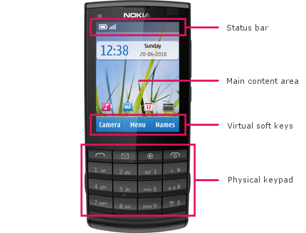
Figure: Main UI elements of a touch and type device
The display resolution on a touch and type device is 240 x 320 pixels (3:4).
For more information about touch and type, see:
Series 40 Touch and Type UI Style Guide on Nokia Developer for an overview of the touch and type UI.
Designing for Series 40 Touch and Type on Nokia Developer for guidelines on designing MIDlets for the touch and type UI.
On a full touch device, the touch screen provides the primary means of user interaction and input. The only mandatory physical keys are the call creation and call termination keys, and the keyguard switch. The device can also have a few extra keys, such as the volume key. For text input, the full touch UI provides a virtual keyboard.
The following figure shows the main elements of the full touch UI.
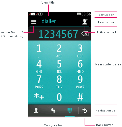
Figure: Main UI elements of a Series 40 full touch device
Unlike the touch and type UI, the full touch UI does not include virtual softkeys. Instead, most commands are mapped to two action buttons located in the header bar:
Action button 1 is positioned to the right of the view title and functions as the primary action button. It displays the highest-priority positive command. You can define a custom icon for the command by using an
IconCommand.Action button 2 is positioned to the left of the view title and always shows an options icon. Selecting it opens the list of remaining commands (assuming any are available).
The navigation bar at the bottom of the touch screen contains
the Back button, to which either the BACK or EXIT command is mapped, and optionally a category bar for
switching between different views within the same application.
The display resolution on a full touch device is 240 x 400 pixels (3:5).
For more information about full touch, see:
Series 40 Full Touch Design Guidelines on Nokia Developer for an overview of the full touch UI and information about design guidelines you should follow when developing MIDlets for the UI.
High-level UI components in this library for instructions on high level LCDUI components.
Low-level UI components in this library for instructions on how to launch a virtual keyboard for low-level UI elements on full touch devices.
Full touch Nokia Asha software platform devices
Nokia Asha UI combines the use of the swipe gesture and back hardware key for navigation, and therefore application have no mandatory control areas on screen. Each application view can be easily designed for its main purpose, that maximises the amount of relevant content on the UI. The base layout in Nokia Asha has two main areas: status bar and content area.
In addition to using the content area for application content, application can add optional controls, Category bar (with tabs or actions) and header bar. When the view offers few, rarely used options only, placing them under the options is possible. The Options menu is accessed by swiping from the bottom of the screen. When the Options menu is available, the screen shows an Options menu indicator at the bottom. Swiping the UI from the right side of the screen towards the left or long pressing the Back key terminates the application.
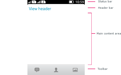
Figure: Main UI elements of an Nokia Asha software platform devices
The display resolution on a Nokia Asha software platform devices is 240 x 320 pixels (3:4).
For more information about Nokia Asha software platform devices, please see Nokia Asha Design Guidelines.