UI elements and controls
The UI (User Interface) in Series 40 and S60 devices consists of at least one display for showing output to mobile device users and keys that allow the users to enter input. The size and resolution of displays varies among devices, as do the keys available for input.
The display consists of different elements, of which the following terms are used:
Screen
The screen is the topmost display component, corresponding to the entire pixel area of the physical screen.
Window
An area on the display. There are windows that take up the entire display, and other windows that only take up part of the display. For example, pop-up windows do not cover the entire display. Pop-up windows have frames and typically the underlying window is partly visible behind the pop-up window.
Pane
A subelement of a window that is dedicated to a specific purpose. Windows may contain several panes, and panes may contain subpanes.
Application window
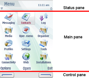
An application window is a principal window filling up the entire screen. It is usually not used directly for display, but just as a parent for the various panes. A typical application window is divided into the following panes (described below):
Status pane
Main pane
Control pane
UI window
The following figure illustrates a typical window for an application:
Typically, windows contain a status pane, a main pane, and a control pane.
By default, the status pane:
occupies the top part of the display
shows information on the current application and state, and general information about the device status, such as signal and battery strength
The main pane is in the middle of the display and is where applications are drawn on the display and show their application state.
By default, the control pane:
occupies the bottom part of the display
displays the labels associated with the softkeys
appears even when pop-up windows are on the display, although they are not contained in the pop-up window.
Mobile device users navigate through applications based on input from selections in the control pane or key presses. The traditional hierarchical tree structure forms the basis for navigation, with mobile device users moving from one node, which represents a state, to another.
For more information on UI elements, see the following documents:
S60 3rd Edition FP2 Style Guide for S60 3rd Edition FP2 UI information.
S60 UI Style Guide for UI information on earlier S60 platforms.
Series 40 UI Style Guide for Series 40 UI information.

