ComboBox
A ComboBox is a list that allows only one selection at a time. When a user clicks the combo box button, a drop-down list of elements allows the user to select a single element. The combo box is driven by the list model and allows all the renderer features of the List as well.
Other components that can display one-of-many choices are groups of radio buttons, check boxes, buttons, and lists. Groups of radio buttons are generally the easiest for users to understand, but combo boxes can be more appropriate when space is limited or more than a few choices are available. Lists are not always attractive, but they are more appropriate than combo boxes when the number of items is large (say, over five).
The following code creates a combo box (a list model that is built from check boxes) and sets it up:
String[] content = { "Cat", "Dog", "Horse", "Bunny", "Fox" };
// 1. Creating the combo box
ComboBox comboBox = new ComboBox(content);
// 2. Setting a checkBox renderer
comboBox.setListCellRenderer(new checkBoxRenderer());
// 3. Adding a action listener to catch user clicking to open the ComboBox
comboBox.addActionListener(myActionListener......);
The following notes correspond to the comments in the code above.
-
This combo box code contains an array of strings, but you could just as easily use labels instead.
-
To put anything else into a combo box or to customise how the items in a combo box look, you need to write a custom renderer.
-
The next line of code (which calls setListCellRender) registers an action listener on the combo box.
The following is a sample of checkBox renderer code:
/**
 * Demonstrates implementation of a renderer derived from a CheckBox
 */
private static class checkBoxRenderer extends CheckBox implements ListCellRenderer {

    /** Creates a new instance of checkBoxRenderer */
    public checkBoxRenderer() {
        super("");
    }

    // Setting the current check box text and status
    public Component getListCellRendererComponent(List list,
    Object value, int index, boolean isSelected) {
        setText("" + value);
        if (isSelected) {
            setFocus(true);
            setSelected(true);
        } else {
            setFocus(false);
            setSelected(false);
        }
        return this;
    }

    // Returning the list focus component
    public Component getListFocusComponent(List list) {
        setText("");
        setFocus(true);
        setSelected(true);
        return this;
    }
}
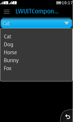
The sample code produces the combo box displayed in Figure 1.

Figure: ComboBox example
It is recommended to use the new PopupChoiceGroup component in Series 40 full touch devices.