Layout managers
This chapter shows you how to use the LWUIT layout managers. It also gives an example of writing a custom layout manager. For each layout manager, this chapter supplies sample code demonstrating how to use the layout manager and a general illustration.
The Lightweight UI Toolkit contains the following layout managers:
-
BoxLayout (vertical + horizontal)
Horizontal BoxLayout (BoxLayout.Y_AXIS) is the default layout in the forms in LWUIT for Series 40.
By using containers, it is possible to have several different layout managers in one form.
BoxLayout.Y_AXIS
The default layout in forms in LWUIT for Series 40 is BoxLayout.Y_AXIS, where components are laid out in a column on top of each other.
BoxLayout boxLayout = new BoxLayout(BoxLayout.Y_AXIS);
In this layout, the box layout manager honours the component height of each layout component to fill the height of the container, and the width is determined by the container width. Any extra space appears at the bottom of the container, as shown in Figure 1.
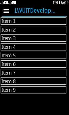
Figure: BoxLayout.Y_AXIS components in a row
BoxLayout.X_AXIS
To lay out components in a row next to each other, use BoxLayout.X_AXIS as the axis indication.
BoxLayout boxLayout = new BoxLayout(BoxLayout.X_AXIS);
In this layout, the box layout manager honours the component width of each layout component to fill the width of the container, and the height is determined by the container height. Any extra space appears at the right side of the container.
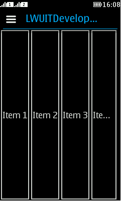
Figure: BoxLayout.X_AXIS components in a row
FlowLayout
The FlowLayout class provides a very simple layout manager. It is the default layout manager for Container objects.
The FlowLayout class puts components in a row, sized at their preferred size. If the horizontal space in the container is too small to put all the components in one row, the FlowLayout class uses multiple rows. To align the row to the left, right, or center, use a FlowLayout constructor that takes an alignment argument. The code snippet below creates a FlowLayout object and the components it manages.
...
    FlowLayout exampleLayout = new FlowLayout();

    flowLayoutForm.setLayout(exampleLayout);

    flowLayoutForm.addComponent(new Button("A longer button 1"));
    flowLayoutForm.addComponent(new Button("Button 2"));
    flowLayoutForm.addComponent(new Button("Button 3"));
    flowLayoutForm.addComponent(new Button("4"));
    flowLayoutForm.addComponent(new Button("Button 5"));
...
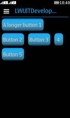
Figure: FlowLayout default alignment
When constructing a FlowLayout manager, you can select either the Left, Right, or Center option to set up the component's orientation. The default alignment is Left. The following code snippet applies the Right component orientation to the above exampleLayout.
FlowLayout exampleLayout = new FlowLayout(Component.RIGHT);
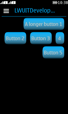
Figure: FlowLayout with Right alignment
GridLayout
A GridLayout object places components in a grid of cells. Each component takes all the available space within its cell, and each cell is exactly the same size.
The code snippet below creates the GridLayout object and the components it manages.
final Form mainForm = new Form("Grid Layout");
GridLayout exampleLayout = new GridLayout(4,2);
mainForm.setLayout(exampleLayout);

mainForm.addComponent(new Button("Button 1"));
mainForm.addComponent(new Button("Button 2"));
mainForm.addComponent(new Button("Button 3"));
mainForm.addComponent(new Button("Button 4"));
In this example, the constructor of the GridLayout class creates an instance that has two columns and as many rows as necessary.
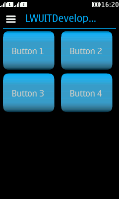
Figure: GridLayout with two columns
BorderLayout
A BorderLayout object has five areas. These areas are specified by the BorderLayout constants:
-
Center
-
East
-
North
-
South
-
West
When adding a component to a container, specify the component's location (for example, BorderLayout.CENTER) as one of the arguments to the addComponent method. If this component is missing from a container, controlled by a BorderLayout object, make sure that the component's location was specified and that no other component was placed in the same location. So either:
addComponent(BorderLayout.CENTER, component) // preferred
Or:
addComponent(“Center”, component) // valid but error prone
The center area gets as much of the available space as possible. The other areas expand only as much as necessary to fit the components that have been added to it. Often a container uses only one or two of the areas of the BorderLayout object — just the center, or the center and the bottom.
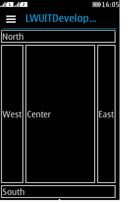
Figure: BorderLayout locations
GroupLayout
GroupLayout is a layout manager that was developed for GUI builders such as Matisse, the Java SE GUI builder delivered with the NetBeans IDE. Although the layout manager was originally designed to suit GUI builder needs, it also works well for manual coding. To get more information, you can refer to the GroupLayout API (http://java.sun.com/javase/6/docs/api/javax/swing/GroupLayout.html), or review the Swing GroupLayout tutorial at http://java.sun.com/docs/books/tutorial/uiswing/layout/group.html.
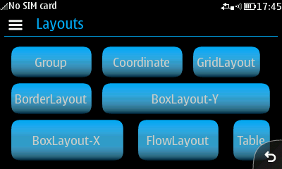
Figure: GroupLayout
Coordinate layout
Unlike other layout managers, coordinate layout assigns a component a position in relation to the space available within the UI. The coordinate layout allows developers to position components within an X/Y location; however, it does not guarantee the position will not change, and does not determine absolute positions.
Instead, coordinate layout accepts relative positions and calculates the actual position based on available space. This is essential, since the available size for a container might change at runtime based on font size, screen rotation, et cetera.
Unlike the other standard layouts in LWUIT, the coordinate layout allows positioning components on top of one another to achieve z-ordering. The z-ordering is determined by the order in which the components are placed into the parent container. The last component added is the one on top.
Display.init(this);
final Form mainForm = new Form("Coordinate Layout");
mainForm.setLayout(new CoordinateLayout(200, 200));

Label centeredLabel = new Label("Center");
centeredLabel.setX(90);
centeredLabel.setY(90);
centeredLabel.getUnselectedStyle().setBgTransparency(100);
centeredLabel.getUnselectedStyle().setBgColor(0xff);

Label underCenter = new Label("Under Center");
underCenter.setX(80);
underCenter.setY(95);

Label top = new Label("Top Left");
top.setAlignment(Component.CENTER);
top.setX(0);
top.setY(0);
top.setPreferredW(200);
top.setPreferredH(30);
top.getUnselectedStyle().setBgColor(0xff0000);

mainForm.addComponent(underCenter);
mainForm.addComponent(centeredLabel);
mainForm.addComponent(top);

mainForm.show();
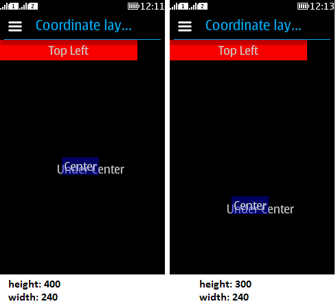
Figure: Coordinate layout example
There are several interesting things we can glean even from this simple example:
-
Coordinate layout must be hard-coded. The coordinates are implicitly scaled by LWUIT, so there is no need to use logic, such as getWidth/Height, to calculate positions.
-
Elements are sized based on their preferred size, yet positioned based on their X and Y coordinates. Their dimensions determined via setWidth and setHeight are ignored.
-
Unlike the X and Y coordinates which are relative to layout dimensions, the preferred size is absolute in pixels and should be calculated based on content dimensions. This works as expected as long as you do not change the preferred size on your own.
-
Alignment and other LWUIT related positioning logic should work as you would expect.
Table layout
The table layout is a part of the table component discussed later; however, it is quite useful also on its own. It is largely inspired by the HTML table tag, and also influenced by AWT's GridBagLayout.
The table layout is a constraint based layout (similar to the border layout). Other layout managers expect components to be added on their own. For example:
container.addComponent(component);
The table layout container expects something like this:
container.addComponent(tableConstraint, component);
Notice that this syntax is optional. If the constraint is omitted, the component is placed in the next available cell.
The table layout will automatically size components to the largest preferred size in the row or column until you run out of space. If the table is not horizontally scrollable, this happens when the edge of the parent container is reached (near the edge of the screen), and additional components are "crammed together". Notice that all cells in the table layout are always sized to fit the entire cell. To change a cell's alignment or margin, use the Component or Style methods.
The constraint argument is an instance of TableLayout.Constraint that can be used only once. Reusing the instance will cause an exception.
A constraint can specify the absolute row/column where the entry should fit, as well as the spanning between cell boundaries.
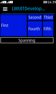
Figure: Table layout sample (background colour added separately)
In the figure, the "First" cell is spanned vertically while the "Spanning" cell is spanned horizontally. This is immensely useful in creating elaborate UIs.
Constraints can also specify a height/width for a column/row that will override the default. This size is indicated in percentage of the total table layout size. In the code below, you can see that the "First" label is sized to 50% width, while the "Fourth" label is sized to 20% height.
final Form mainForm = new Form("Table Layout");
TableLayout layout = new TableLayout(4, 3);
mainForm.setLayout(layout);
TableLayout.Constraint constraint = layout.createConstraint();
constraint.setVerticalSpan(2);
constraint.setWidthPercentage(50);
mainForm.addComponent(constraint, new Label("First"));
mainForm.addComponent(new Label("Second"));
mainForm.addComponent(new Label("Third"));

constraint = layout.createConstraint();
constraint.setHeightPercentage(20);
mainForm.addComponent(constraint, new Label("Fourth"));
mainForm.addComponent(new Label("Fifth"));
constraint = layout.createConstraint();
constraint.setHorizontalSpan(3);
Label span = new Label("Spanning");
span.getStyle().setBorder(Border.createLineBorder(2));
span.setAlignment(Component.CENTER);
mainForm.addComponent(constraint, span);
mainForm.show();