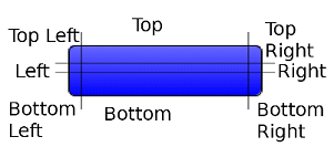
Borders
The Style object supports defining custom rendering of a border. There are several default built-in border types (see the Javadoc™ of the Border class). Borders can either replace the background painter (as is the case with round borders and sometimes with image borders), or they can be rendered after the component itself is rendered. A custom border can be built by deriving the Border class and overriding the appropriate methods.
A border is rendered into the padding area of the component, so it is important that the component padding is large enough to contain the border drawing.
Using the getStyle method to programmatically override the default borders of a Button in the full touch UI does not work as expected, because the background colour of the Button has been done with image borders. In these cases it is recommended to make changes to the theme resource file.
Bevel
The bevel border type presents a simple 3D style border that can appear lowered or raised, providing simple depth perception for actions such as button presses.

Figure: Bevel lowered border)

Figure: Bevel raised border
Etched
The etched border type provides a look similar to an engraved line. Like the bevel border, it too can appear raised or lowered.

Figure: Etched lowered border

Figure: Etched raised border
Line
The line border just draws a rectangle around the component with the option of defining the thickness and colour of the rectangle.
Round
The round border draws a rounded rectangle and optionally fills the background appropriately.
The round border might be very expensive performance-wise! A round border is cheap for a completely opaque solid color. However, when using features such as gradients, images, or alpha channel, the round border effect is calculated on the fly. This is computationally expensive. We recommend trying to achieve these same effects with image borders which are cheaper.
The round border supports defining its color (or using the theme color) and defining the size of the arcs rounding the border.

Figure: Round border
Image
The image border option will only appear when images exist in the resource file. Image borders come in 4 flavors: 9 part, 3 part, horizontal, and vertical.
9 Part
Uses 9 or 8 images to represent the border for the component. The structure is as shown in Figure 6:

Figure: Part Image Border
Notice that the center image is optional. The top, bottom, left, and right images are tiled while the corners (Top Left, Top Right, Bottom Left, and Bottom Right) are kept in place. The center image (if defined) is also tiled. This allows LWUIT to resize the component without any scaling, degradation, performance cost, or memory overhead.
Remember that drawing an image is an expensive operation, so images in the image border should not be too small. For example, a common designer mistake is to produce a single pixel image for tiling. LWUIT seamlessly crops tiled images, so you should make an effort to make images a reasonable size (when in doubt, use something in the area of 80-100 pixels).
3 Part
The 3 Part is somewhat unique to LWUIT and relies on MIDP's fast rotation drawing. It assumes perfectly rectangular images and draws the top left image rotated to produce all corners, and does the same for the top image (center is again optional and used as usual). Thus the 3 part border can produce some attractive results in a smaller size.
Horizontal/Vertical
The image border is highly biased to symmetric shapes that can be enlarged to all directions. However, some shapes (such as the iPhone's angular back button) cannot be cut into a 9-patch image without causing artifacts.
The Horizontal and Vertical Image borders accept 3 images each and only grow on one axis. We do not recommend using them freely; even when text (which can vary wildly in size) is not used, one often needs to align to text which requires resizing.