Tabs
Tabs are containers that let the user switch between a group of components that all share the same space by focusing on a tab with a title, an icon, or both. The user chooses which component to view by selecting the tab corresponding to the desired component.
To create a tab pane, instantiate Tabs, create the components you wish it to display, and then add the components to the tabbed pane using the addTab or insertTab methods. Tabs have the ability to remove tabs as well, by calling removeTabAt(int index) at a given position index. A tab is represented by an index corresponding to the position it was added in, where the first tab has an index equal to 0 and the last tab has an index equal to the tab count minus 1.
If the tab count is greater than 0, then there is always a selected index, which by default is initialised to the first tab. If the tab count is 0, then the selected index is -1.
Tabs have four different tab placement orientations. The default tab placement is set to the TOP location. You can change the tab placement to LEFT, RIGHT, TOP, or BOTTOM using the setTabPlacement method.
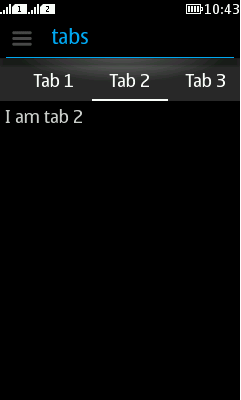
The following code creates a pane with tab placement at the top, and places a Label inside each tab:
Tabs tabs = new Tabs(Tabs.TOP);
tabs.addTab("Tab 1", new Label("I am a Tab!"));
tabs.addTab("Tab 2", new Label("I am tab 2"));
tabs.addTab("Tab 3", new Label("I am tab 3"));
...
It is recommended to use Category bar instead of Tabs in Series 40 full touch for better platform look and feel. However, developers that want to brand their applications can consider using LWUIT Tabs.
An example of Tabs is displayed in Figure 1.

Figure: Form with tabs