Basic view elements

Basic view elements are also referred as "view chrome" or just "chrome".
Summary:

  • Basic view elements contain the same information in different platform releases, but the visualisation differs.

  • Non-touch and touch and type layouts are very similar and contain:

    • View label.

    • Menubar.

  • Full touch chrome has unique chrome elements:

    • Status bar.

    • Header bar.

    • Back button.

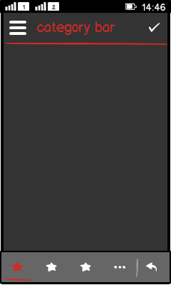
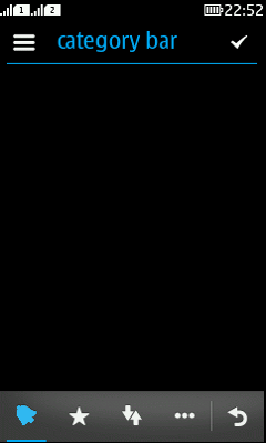
    • Category bar.

    • All chrome elements are inherited from LCDUI or Nokia UI.

LWUIT

Related design guidelines

Basics

Figure: Basic view chrome

  • Interaction:

    • Non-touch and touch and type:

      • View title:

      • Menubar (aka softkey zone):

    • Full touch:

  • Structure:

    • View title is a Label component.

    • Full-touch chrome is inherited from LCDUI Canvas.

Sizes found from here:

Formats and platform specific features

Full touch

Touch and type

Non-touch

Description

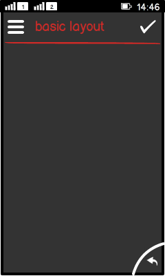
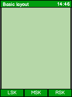
Basic view layout

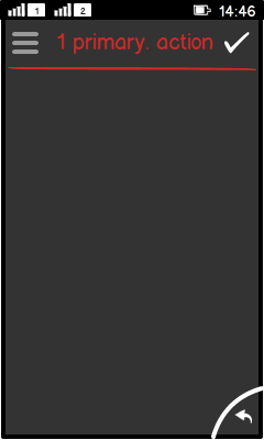
  • Full touch:

    • View title in the header bar.

    • Back/Exit button as an icon in the lower-right corner.

    • Options menu icon left aligned in the header bar.

    • Primary action icon right aligned in the header bar.

  • Touch and type:

    • View title at page top.

    • Menubar at page bottom.

  • Non-touch:

    • View title at page top.

    • Menubar at page bottom.

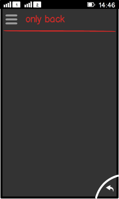
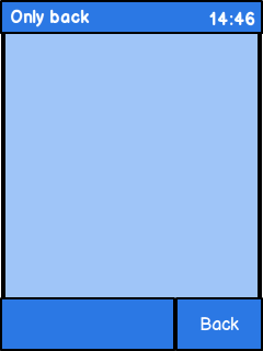
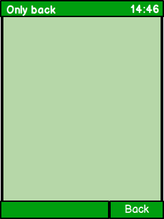
No actions

  • Full touch:

    • Action button 1 empty.

    • Options menu icon dimmed.

  • Touch and type:

    • LSK and MSK are empty.

    • RSK usually with Back or Cancel.

  • Non-touch:

    • LSK and MSK are empty .

    • RSK usually with Back, Exit or Cancel.

1 (primary) action

  • Full touch:

    • Action button 1 with icon of the action; Options menu dimmed.

    • If there is no meaningful icon metaphor available, do not place any icon in action button 1. The action should be defined for the Options menu instead.

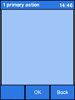
  • Touch and type:

    • LSK empty.

    • MSK primary action as text.

    • RSK usually with Back or Cancel.

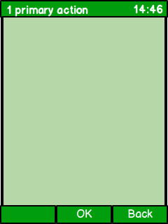
  • Non-touch:

    • LSK empty.

    • MSK primary action as text.

    • RSK usually with Back, Exit or Cancel.

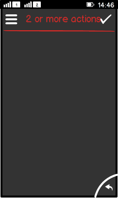
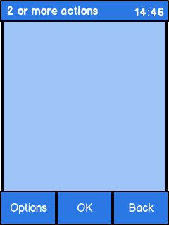
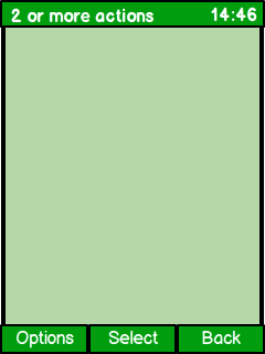
2 or more actions

  • Full touch:

    • Action button 1 with icon of the action.

    • If there is no meaningful icon metaphor available, do not place any icon in action button 1. The action should be defined for the Options menu instead.

    • Options menu is always active.

  • Touch and type:

    • LSK Options.

    • MSK primary action as text.

    • RSK usually with Back or Cancel.

  • Non-touch:

    • LSK Options.

    • MSK primary action as text.

    • RSK usually with Back, Exit or Cancel.

Not recommended.

Not recommended.

CategoryBar (Tab behaviour)

  • Full touch — available.

  • Touch-and-type — tabs not recommended.

  • Non-touch — tabs not recommended.

Note:

Placing actions into action button 1 and the Options menu:

  • If there is no DefaultCommand, all commands go to the Options menu.

  • If there is a DefaultCommand defined, but there is no icon specified, action button 1 shows the "Checkmark" icon.

  • If there is a DefaultCommand defined and there is an icon specified, the icon is shown in action button 1.