Default themes
LWUIT for Series 40 provides default themes for Series 40 full touch, touch and type, and non-touch UI styles. There are multiple LWUIT library packages available with different sets of themes (all themes in one package, and separate packages for non-touch, touch and type, and full touch themes). There is also a package with no themes in case the developer has created a custom theme.
Note that it is possible to modify any of the existing Series 40 theme files in Resource Editor to override any style with a custom style.
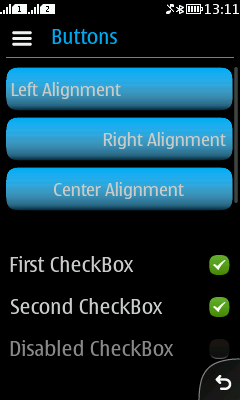
Series 40 full touch theme
The full touch theme adapts to the native theme of the device. LWUIT components derive their colors from the system theme colors. The Button component has a three layer theming including the Button shape, color and gradient.
Header bar, Options menu, and Back button are represented by native components and are thus not customisable. The usage and appearance of these native items is described in the Commands chapter. If custom branding is needed, then the developer should consider setting the application to full screen and using TitleArea for the application.

Figure: Series 40 full touch theme
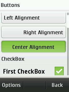
Series 40 touch and type theme
Touch and type theme uses hardcoded color scheme because some native theme colours cannot be acquired from the system.
TitleArea and soft keys are freely customisable.
UI components are large enough to be touched with a finger.

Figure: Series 40 touch and type theme
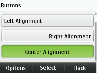
Series 40 non-touch theme
Non-touch theme uses hardcoded color scheme because native theme colors cannot be acquired from the system.
TitleArea and soft keys are freely customisable.

Figure: Series 40 non-touch theme
Customising Series 40 themes
You can take Series 40 theme files as a basis and customise any parts of them.
You can use LWUIT Resource Editor to open and modify the theme files. See the Resources section to find out how to edit the themes bundled in the resource files. See chapter Setting different theme for different devices in section Custom themes to find out how to take customised resource files into use in your application.