Button
The eSWT Button class
can be used to produce different button types

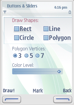
Figure: CHECK and RADIO style Buttons
Button widget supports the following button types (style parameter in parentheses):
check box (
CHECK)radio button (
RADIO)toggle switch (
TOGGLE)push button (
PUSH)
To check the selection status of check boxes and radio buttons, use
the getSelection() method. To catch all selections, use SelectionListener.
Push buttons can be compared to Commands
because their selection activates the operation immediately. Use SelectionListeners
to catch a selection of a push button.
Toggle buttons have no special behavior.
For examples of check boxes and radio buttons, see Button, Slider Canvas demo
in the eSWT Showcase.
For an example of push buttons, see Dialogs demo
in the eSWT Showcase.