Components

Form

LWUIT LCDUI
  • Root for the UI library.

  • Contains TitleBar, MenuBar, and ContentPane.

  • The correct layout is automatically created when selecting the Series 40 theme.

  • Screen type; root for the UI library.

  • Contains Status zone, Header bar (in FT), Main zone, and bottom navigation zone/Softkey zone.

  • Correct layout automatically created when the target is selected.

Lists

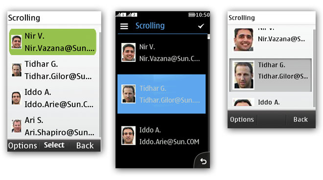
Figure: List in non-touch, full touch, and touch and type

LWUIT LCDUI
  • Content can be extracted from any source.

  • Single column.

  • Supports Action 1 in FT when TitleBar is used.

  • Supports Radio buttons, Check boxes, and icons.

  • Supports long press.

  • Multiline list items possible, different fonts and sizes can be applied to different lines.

  • Supports customization; for example, a carousel control, spinner or separator can be added.

  • Can be used to create a contextual menu by placing it inside a popup.

  • Content can be extracted from any source.

  • Single column.

  • No support for Action 1 in FT or MSK in non-touch and touch and type.

  • Supports Radio buttons, Check boxes, and icons.

  • Supports long press.

  • Item editing limited to text wrap and truncation.

  • Cannot be customized.

Labels

LWUIT LCDUI
  • A “title component”.

  • Can be combined with other UI components.

  • Acts as a List items within LWUIT list components.

  • Supports marquee scrolling.

  • StringItem within Form can be used as a label but cannot be combined to other components.

  • In LCDUI, a label is usually part of the component.

Button, Radio Button and Checkbox

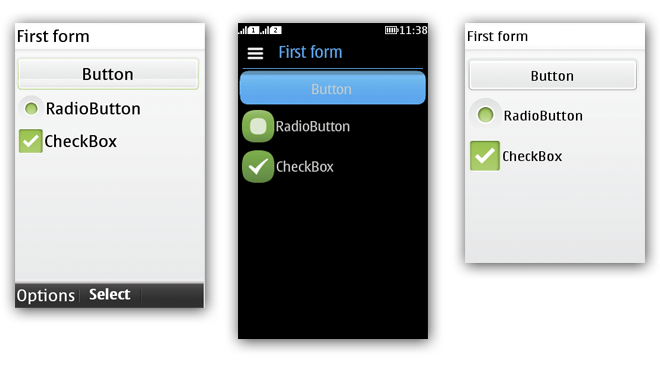
Figure: Button, RadioButton and CheckBox in non-touch, full touch, and touch and type

LWUIT LCDUI
  • Button is styled like the LCDUI button.

  • Check box and Radio button controls are currently on the left side of the item label; will be moved to the right side.

  • Radio buttons and checkboxes can be freely used wherever needed.

  • Check box can be used as a single setting item to switch something ON/OFF.

  • Button is a StringItem with type BUTTON.

  • Check box and Radio button controls are placed on the right side of the list item.

  • Radio buttons and checkboxes are tied to list items either in List screen, choice group (Form), or the Nokia UI pop-up list.

  • A single check box for setting something ON/OFF is not supported.

Tab

Figure: Tabs and Calendar in non-touch, full touch, and touch and type

LWUIT LCDUI
  • Full touch: bottom part of display; Touch and type, and Non touch: top part of content pane.

  • Contains only textual labels by default, can be modified to support icons.

  • Technically unlimited number of tabs.

  • Recommendation: In touch and type maximum 4 tabs, in full touch maximum 4 tabs in portrait and 6 in landscape.

  • Recommendation: In full touch, use the Category bar instead.

  • Recommendation: Avoid tabs in touch and type, because they take a lot of screen real-estate.

  • Full touch: Category bar at the Bottom navigation zone; Touch and type: not supported; Non touch: top part of Main zone.

  • Icons only. Exception: Category bar extension has both icon and text.

  • Full touch: Maximum 15 Categories fit in the Extension.

  • Recommendation: In full touch, maximum 4 tabs in portrait and 6 in landscape.

TextArea and TextField

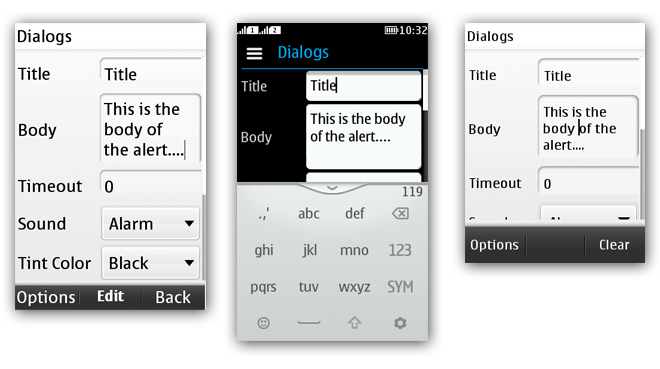
Figure: TextAreas and TextField in non touch, full touch, and touch and type

LWUIT LCDUI
  • The appearance differs slightly from LCDUI.

  • When tapped on/selected, changes the area/field into edit mode.

  • In full touch, the virtual keyboard provided by the Series 40 platform (instead of the LWUIT keyboard) is used for text input.

  • In touch and type and non touch, the physical keys are used for text input.

Functionality is the same as described for LWUIT.

Dialog

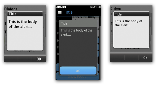
Figure: Dialog in non-touch, full touch, and touch and type

LWUIT LCDUI
  • Can be used with or without a title.

  • Fixed size or popup that scales according to the content size.

  • Button to acknowledge or disappears with time out.

  • Title is optional but the space will always be reserved.

  • Fixed size.

  • Button(s) to acknowledge or disappears with time out.

Additional components not in LCDUI

ComboBox
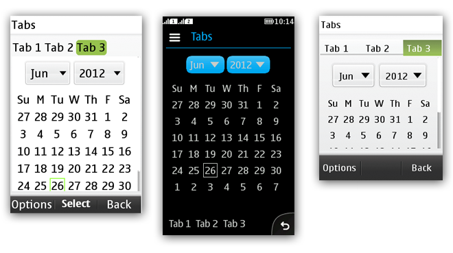
Figure: ComboBox for non touch, full touch, and touch and type

  • Consists of two dependent selections of items.

  • Can be used for multiple use cases, for example, selecting month and year.

  • Can contain both numbers and text.

  • Opens a drop-down menu with selectable items.

    • Works like Radio buttons; one item is selected at a time.

Calendar

  • Predefined month and week view.

  • When a day is selected, the day view opens.

Tree

  • Same item sizes as the lists.

  • Icons styled to match the overall platform style.