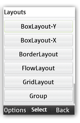
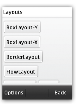
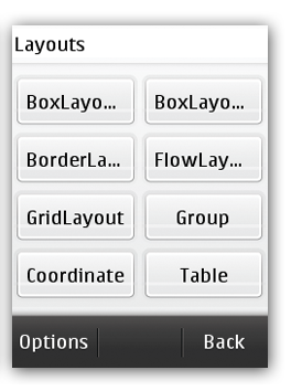
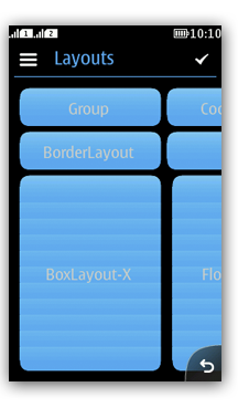
Creating layouts with the Layout Manager
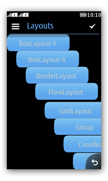
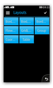
LWUIT supports much more freedom in layout creation than LCDUI
does. The following layout managers are supported for Series 40 applications.
| Layout |
Description |
Screenshot |
BorderLayout |
Allows positioning the UI components based on Top, Bottom,
Center, Left, and Right attributes. |
|
BoxLayout |
Allows placing the UI elements on top of each other or in
a row. |
|
FlowLayout |
Default layout manager. Places components in a row. Components are sized in the preferred size. Can use multiple rows if components do not fit on one row. Elements can be aligned to left, center or right. |
|
GridLayout |
Places components in a grid of cells where each component
takes all the available space within its cell, and all cells are of
exactly the same size. |
|
GroupLayout |
For complex layouts. Components can be grouped and positioned in sequential or parallel
arrangement. Sequential group: positions child elements one after another. Parallel group: positions child elements in the same space
on top of each other. Elements can be aligned horizontally or vertically. |
|
CoordinateLayout |
Assigns a component an absolute position in relation to the
space available within the UI. Components can be positioned within an X/Y location but the
positions are relative. The position is calculated based on the available
space. |
|
TableLayout |
Components are automatically sized to the largest preferred
size until you run out of space. If the table is not horizontally scrollable, this happens when
the edge of the parent container is reached (near the edge of the
screen), and additional components are "crammed together". Cells are always sized to fit the entire cell. |
|

