Using Series 40 themes and the Resource Editor
Creating custom themes for LWUIT applications
Instead of using the provided Series 40 themes, you can also create your own themes or edit the existing themes with the Resource Editor WYSIWYG tool by changing some or all of the ready-made theme graphics. All graphics in each theme are fully customizable, but the easiest way to change the style of your application is to change the background graphics and maybe highlight color to match it.
When customizing your application's theme, ensure that the contrast is high enough between background, UI elements and font colors.

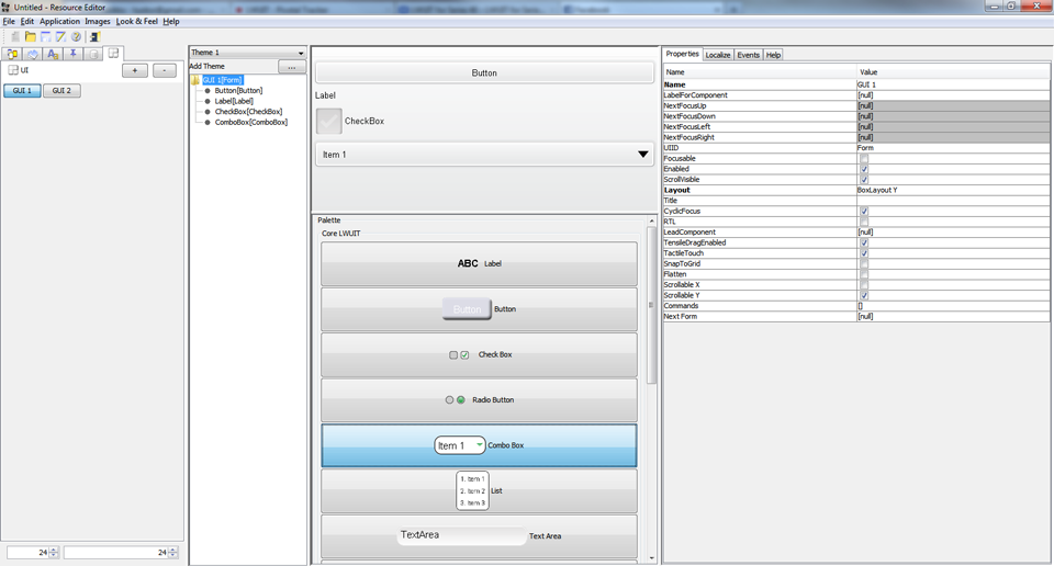
Figure: Resource Editor with a Series 40 touch and type themed LWUIT demo application
When creating custom graphics, you should
Check the correct sizes for the graphics using the component info.
Create the new graphics in the matching size for each platform version.
You can slice the graphics that need to be scaled using the slicing tool included in the resource editor or import the images as sliced versions to the Resource Editor.

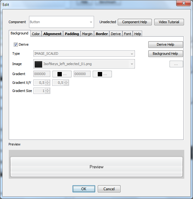
Figure: Editing the Button component style in the Resource Editor
Note: You can also add a custom icon for defaultcommand and tabs in Resource Editor.
Creating custom views and navigation
The Resource Editor GUI Builder makes it easy to create custom views and navigation. The ready-made components can be added from the components palette to the actual UI view by drag and drop.

Figure: Creating a form by dragging and dropping components in Resource Editor
To create navigation logic between the application views:
Select the component that should do a certain action.
Open its editing view.
Map the wanted action to the selected component.
The action can be, for example, Exit, Back, navigation to another view and so on.
In the editing view, you can also add icons to buttons.

Figure: Editing the button component in Resource Editor