Designing for multiple screen sizes
You can either develop several versions of a widget for use on different mobile devices or design widget layout that can adapt to different screen sizes.
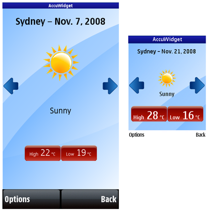
Relate the position and size of each screen control to the dimensions of the display. This enables the same set of information to be presented on the screen in all resolutions; higher resolution devices just display finer graphics. However, this layout method works only when the screen aspect ratio is always the same. It does not produce good results when the screen orientation changes. Therefore, scaling should also account for aspect ratio change.

Figure: A widget on 360 x 640 and 240 x 320 pixel screens
Use a cascading style sheet (CSS) to specify relative measurements for all characteristics, such as line height, margins, padding, of all screen elements. You can use the following relative units to specify the characteristics of screen elements:
em—font size in relation to the parent element.ex—font height in relation to the lowercase character x.px—font size in relation to the resolution of the viewing device.
Mobile devices support a limited number of font sizes. Use relative font sizes instead of absolute font sizes.
For an example of how to use CSS to design for multiple screen sizes, see the AccuWidget Example on Forum Nokia.
To base the layout on percentage
Use the em unit to specify the characteristics of elements in relation to their parent element. For example, the following example specifies that the font size of a first level heading is 100% greater than that of a second level heading, and that the font size of a second level heading is 50% greater than that of a third level heading:
h1 {
    display: block;
    font-size: 2em;
    margin: .67__qem 0 .67em 0;
    font-weight: bold;
}

h2 {
    display: block;
    font-size: 1.5em;
    margin: .83__qem 0 .83em 0;
    font-weight: bold;
}
The following example specifies that images are scaled by using per cent and pixel measurements:
    #graphicalForecast img {
        height: 35%;
    }

    #locationTable td {
        width: 52px;
        height: 52px;
    }

    #locationTable td img {
        width: 100%;
        height: 100%;
    }