Font style recommendations for the S60 Browser
Why font style is important on mobile devices
Careful consideration about what styles to use when defining fonts is important because:
Mobile devices do not normally have the same variety of fonts as a desktop computer. For information about the fonts available on Nokia devices, see the Design and User Experience Library section Font support.
A font size that looks good on a desktop is often too small to read on a mobile device. For example, many websites use
font-size: 12px. If viewed on a mobile device with a resolution of for example 640 x 360 pixels, the font appears to be very small.
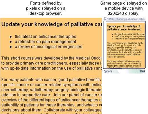
The following example shows how a Web page that uses pixel values to define font size displays on a desktop browser and on a mobile device. The page is barely readable on the mobile device and, since the values are defined as pixels, they do not scale when the mobile device user adjusts the Font Size Setting.

Figure: Font style defined as pixels
Font style recommendations for the S60 Browser
The following table lists some of the ways that font styles can be defined in a Cascading Style Sheet (CSS) with recommendations about which to use when Web pages are displayed in the S60 Browser.
| CSS property Value | Possible values | How it works in the S60 Browser |
Recommended |
|---|---|---|---|
keyword <absolute-size> |
xx-small, x-small, small, medium, large, x-large, xx-large
|
The user agent (S60 Browser) maintains a font size table that maps
the<absolute-size> to a font size that is appropriate
for the device. |
Yes. This is an easy, dependable way to define font sizes. The S60 Browser determines the best font size to display depending on a combination of the device screen size and resolution and the Font Size Setting. See below for more information. |
keyword <relative-size> |
smaller, larger
|
The user agent determines the font size relative to both the font size table and the parent element. | Using <relative-size> may not produce the desired
result since it is based on both the font size table and the parent element
and is therefore not recommended. |
Units of measure
|
pixels
|
Font size is an absolute value based on pixels. | No. Font size should not be defined using pixels. Pixel values do not take screen resolution into account and do not scale depending on the Font Size Setting. |
Units of measure
|
points, in, cm, mm, Picas
|
Font size is an absolute value based on the unit of measure listed. For example, a point (pt) is 1/72 of an inch. |
No. Font size should not be defined using these units of measure. They are better suited for printed documentation. |
Units of measure
|
em
|
Font size is relative to the size of the parent element. 1.0 em is equivalent to the letter M in the parent font-size. For example, if the current font-size 12pt, 1.5em is equal to 18pt. |
Yes. Websites that want to fully utilize the advantages provided by a cascading style can use em or percentages values. The S60 Browser determines the best font size to display based on the relative value of the parent font and the Font Size Setting. Note: Although using these units of measure is a good way to fully utilize CSS features, the way in which they are applied can be complex. You should study the effects of these values before using them in your website. |
Units of measure
|
%
|
Font size is a percentage of the size of the parent element. 100% is equivalent to the size of the parent font-size. For example, if the current font-size 12pt, 150% is equal to 18pt. |
Note: The S60 Browser does scale font size in response to zooming, regardless of how they are defined.
Using <absolute-size>
An
easy and effective way to define font size for the S60 Browser is absolute-size.
absolute-size refers
to an entry in a table of font sizes computed and kept by the user agent,
in this case the S60 Browser. In other words, the S60 Browser keeps a table
of absolute-size keywords and maps those to the best size
font to display on a particular Nokia device. font-size: medium is
the default font size for the S60 Browser.
Using the absolute-size also
ensures that the when the mobile device user changes the Font Size Setting,
the S60 Browser changes the font size to reflect the setting. Following is
simplified example of the font-size table that the S60 Browser could use to
determine which font size to display depending on the absolute-size and
Font Size Setting. For information about the fonts available on S60 Devices,
see the Design and user Experience Library section Font support.
absolute-size |
User-defined Font Size Setting |
Font size to use |
|---|---|---|
| xx-small | Smallest | Appropriate Series 60 Sans - Nokia |
| Small | Appropriate Series 60 Sans - Nokia | |
| Normal | Appropriate Series 60 Sans - Nokia | |
| Large | Appropriate Series 60 Sans - Nokia | |
| Largest | Appropriate Series 60 Sans - Nokia | |
| x-small | Smallest | Appropriate Series 60 Sans - Nokia |
| Small | Appropriate Series 60 Sans - Nokia | |
| Normal | Appropriate Series 60 Sans - Nokia | |
| Large | Appropriate Series 60 Sans - Nokia | |
| Largest | Appropriate Series 60 Sans - Nokia | |
| And so forth | .... | .... |
Font-size styles examples
The following example
specifies fonts that are based on <absolute-size>.
h1 {
font-size: x-large;
font-weight: bold;
}
h2 {
font-size: large;
font-weight: bold;
{
p {
font-size: medium;
}
Effect of style and Font Size Setting example
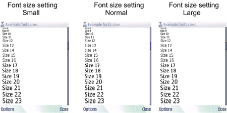
Following
is an example of defining the font size by pixel (for example, font-size:
12px). Notice that the font size does not change regardless of
the Font Size Setting.

Figure: Font size determined by pixels (font-size: px)
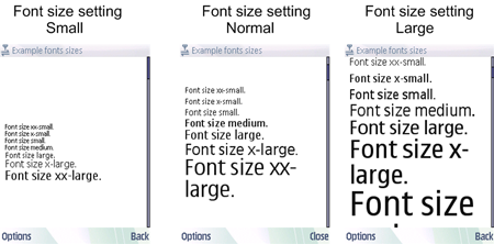
Following is an example of defining the font size by absolute-size (for
example, font-size: medium). Notice that the font size changes
depending on the Font Size Setting.

Figure: Font size determined by absolute-size (font-size:x-large)
Font size setting in the code
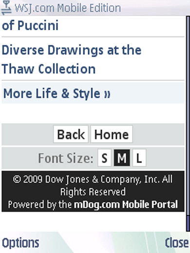
Some websites designed
for small screens have code that allows mobile device users to scale the font
size with the click of a button rather than relying on the mobile devices
Font Size Setting. For example, the following web page has the following code
that runs a server-side script (resizefont.php) to change
the font size.
<div>Font size:
<a href="http://mobilewebsite.com/resizefont.php?sz=1">S</a>
<a href="http://mobilewebsite.com/resizefont.php?sz=2">M</a>
<a href="http://mobilewebsite.com/resizefont.php?sz=3">L</a>
</div>

Figure: Resize font