Designing for small screens
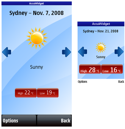
The screen size of mobile devices is significantly smaller than that available on desktop devices. When designing your application, you should carefully consider what is the most relevant content to present on the UI. It is not reasonable to try and fit all the content on a Web page to a device screen. Moreover, the screen size varies between different mobile devices.
For more information, see Screen size and Physical screen size.
Determining the screen size and resolution
S60 devices can have one or more displays. Some S60 devices support specialized cover screens used only by special features and applications built into the device. Other devices support primary and secondary displays.
240 x 320 pixels portrait
320 x 240 pixels landscape
360 x 640 pixels portrait
640 x 360 pixels landscape
800 x 352 pixels landscape (Nokia E90)
Expect future S60 devices to support larger screen resolution.
To find out the screen sizes of your target devices, see Device Specifications. You can filter the devices by platform, device model, or screen size.
Designing content for dynamic screen size
You can use the JavaScript window.screen object to detect the screen resolution using the screen.width and screen.height properties.
To present information so that it appears the same on all resolutions, relate the position and size of each screen control to the dimensions of the display. This results in higher resolution devices displaying finer graphics. However, this layout method works only when the screen aspect ratio is always the same. It does not produce good results when the screen orientation changes.
Embed the items in a
<div>or<table>element with width="100%".Assign the same CSS background-color style to the item and the element.
Anti-alias the item so that it blends well with the element.

Figure: A widget on 360 x 640 and 240 x 320 pixel screens