Laying out pages
Utilizing the "hot spot"
When the S60 Browser opens a Web page, the initial view is on the upper left corner of the page. This “hot-spot” area is very important, as it is the first thing the user sees and focuses on. The most important objects, such as navigation and basic site information, should be placed in or near this hot spot. The initial view should tell the mobile user where he or she has landed (company name or logo, site name, or short summary) and how to navigate further on the site.
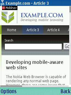
On a mobile device, the hot-spot real estate is limited. For example, on the standard QVGA display, the hot spot covers an area of 240x320 pixels (or 320x240 pixels in landscape mode). It is not necessary to fit everything within the hot spot, but it is recommended to at least start the elements from the hot spot. For example, a horizontal or vertical site navigation element can continue and trail off-screen, as long as the user is able to quickly recognize the element and follow it. Make sure that the navigation element is visually consistent — a background color or a shape acts as a visual clue and helps the user follow the element.
For example, following is a website that has the company logo, site name, search field, navigation bar, and some content all in the hot-spot.

Figure: Hot-spot real estate
To place focus on a specific link after the page loads, add a special “#start” fragment tag on the link element. This is an effective way to direct the user’s attention to a specific place on the page.
Column layout
Pages designed specifically for mobile devices should not use column layout.