Customizing screen controls
You cannot change the size of the standard HTML radio buttons and check boxes. To make them bigger, you must design your own controls. You only need to do this for touch devices.
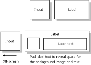
Check boxes and radio buttons are composed of two elements: input and label. The label element contains the text associated with the control whereas the input is the actual check box. Even if you increase the font size of the label to make it bigger, the control remains small. To create a larger control, position the check box or radio button off-screen to hide it by setting it a negative absolute position. Then set a background image for the label that looks like a check box or a radio button. Offset the label text to reveal the background image which shows the control.

Figure: Customizing check boxes and radio buttons
For an example of how to create custom controls, see the STEW example files.
To create custom controls

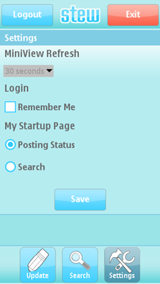
Figure: STEW Settings view with custom controls
Wrap the input and label in an unordered list (ul) to enable absolute vertical positioning of the input element and top-down navigation:
<ul class="cb">
	<li><input id="login_remember_me" type="checkbox"><label id="loginLabelRememberMe" for="login_remember_me"></label></li>
</ul>
Add styles for the HTML elements to the CSS file. Reset default layout for the ul and li elements and bulleted lists. Position the input element off-screen by setting it a negative absolute position, and specify an image for the label background.
/* ************************* */
/* BIGGER CHECKBOX FOR TOUCH */
/* ************************* */
.cb {
	list-style: none;
	padding: 0;
	margin: 0;
}

.cb li{
	padding: 0;
	margin: 0;
}

.cb li label {
	background: transparent url(images/checkbox.png) no-repeat scroll 0 6px;
	padding: 8px 0 5px 30px;
	display: block;
	font-size: 20px;
	font-weight: bold;
	height: 25px;
}

.cb li.checked label {
	background-image: url(images/checkbox_activated.png);
}

.cb li input {
	position: absolute; left: -9999px;
}
To add logic to custom controls, add JavaScript code to the constructor of the
LoginScreenobject in theLoginScreen.jsfile. The following code implements the functionality of the Remember Me check box:function LoginScreen() { ... this.cbRememberMe = document.getElementById( "login_remember_me" ); // Click handling via styles for touch screens. this.cbRememberMe.onclick = function() { Helper.handleCustomControlClick( self.cbRememberMe ); }; }Assign a function to the
onclickevent handler of the custom control and call a helper function that changes the style of the parent item depending on whether thecheckedproperty is set for the control:handleCustomControlClick: function( control ) { control.parentNode.className = control.checked ? "checked" : ""; }Assign the event handler to the input control and set the style to the parent node of the input element to enable using the HTML input as the basis of the control even though it is off-screen, and therefore invisible. Style the label element of the container list item, but get the parent node instead of searching for a sibling item of the appropriate type. The state of the control and events is reused from the input and label HTML composite, and therefore you need not implement them.
To hide the custom controls on smaller screens and devices that do not support touch, redefine the styles and reposition all controls in the CSS file:
/* *************************** */
/* CLEAR THE STYLES FOR BIGGER */
/* CHECKBOX FOR TOUCH          */
/* *************************** */
.cb {
	list-style: none;
	padding: 0;
	margin: 0;
}

.cb li{
	padding: 0;
	padding-bottom: 3px;
	margin: 0;
	position: relative;
	clear: both;
}

.cb li label {
	padding: 2px 0 0 17px;
	background: none;
	font-weight: bold;
	font-size: 12px;
	float: left;
}

.cb li.checked label {
	background-image: none;
}

.cb li input {
	float: left;
	left: auto;
	display: block;
}