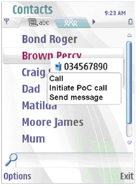
Stylus pop-up menu
The stylus pop-up menu is a separate pop-up mainly used when a view cannot offer dynamic functions, and the pop-up only offers tap-enabled functions. The stylus pop-up menu can also be used directly on top of applications. For example, on an image in Browser, the stylus pop-up menu can be used for offering Save as… and similar options.

Figure: Stylus pop-up menu opened from a preview pop-up. A tap on any other name or even anywhere else on the screen closes the stylus pop-up menu without moving the focus.
Activation of the stylus pop-up menu can be done with a short or long tap, which ever suits the given application and situation the best. Background is not dimmed when the stylus pop-up menu is shown. The menu disappears automatically after six seconds (or as soon as the user selects an item or taps outside the pop-up area).
As the purpose of the component is only to offer some primary functions (a maximum of six functions), the stylus pop-up menu is not a scrollable component. Thus it has no focus.
Using stylus pop-up menus in C++ applications
The API to use for creating a stylus pop-up menu is the Stylus pop-up menu API.
For implementation information, see Displaying commands in a context menu.