Buttons
 |
Summary:
|
Java
Related design guidelines |
Buttons are used in Alerts to provide options for continuing the flow. They use text labels. With touch down, the button shows a highlight colour so the user knows the button press is registered. With touch release, the action is triggered, and the highlight disappears.
Figure 1. Timed alert, alerts with 1 - 3 buttons and with optional icons
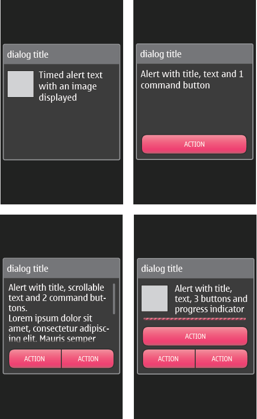 |
You can define 0 to 3 commands for your alert. These commands will appear as buttons on the UI.
|
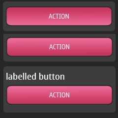
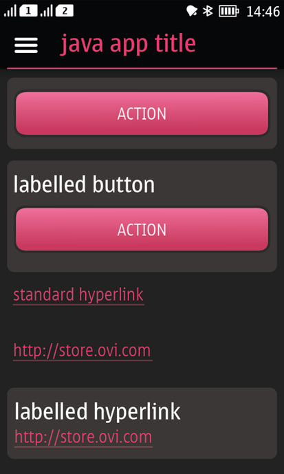
Buttons can also be used in Forms where it is only possible to have one button in one line. So in case two separate buttons are needed, the buttons are placed on top of each other. In Form, you can define your StringItem to be of type 'button', and it will appear as a button in the UI. The button has the same size in both orientations.
Custom buttons
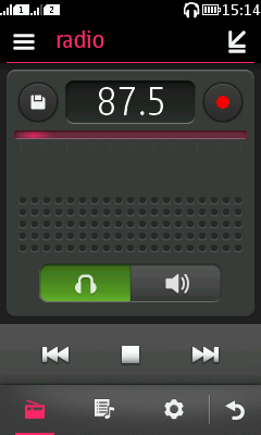
Wrap button. This button would basically be a switch for having either of the items selected and highlighted at all times. By tapping the unselected button it gets the highlight and triggers the defined mode on. At the same time selection is removed from the previously selected button and the highlight colour disappears. The visual look is similar to the button pair in dialogs, like for example in Figure 2.
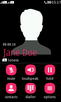
Squircle button. This button style is used in Contact card, for example. It has a squircle shaped button and a text label below the button. Tapping the button gives a visual feedback to the user by showing a pressed state for the button. The action is triggered with touch release.
