 |
Summary:- Possible elements in a Form:
- StringItem:
- Text,
- hyperlink, or
- button.
- TextField
- ChoiceGroup
- Non-exclusive choice, non-expandable element.
- Exclusive choice, expandable element.
- DateField
- Gauge
- ImageItem
- Image
- hyperlink, or
- button.
- CustomItem
- Spacer
- Ticker
|
Java
Related design guidelines
|
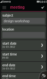
The Java Form can be used for various types of application views, and is by no means restricted to be used to compile a form to collect user input. However, the ready-made Form elements support this type of task very well. All Form elements appear one after another on the view, and the view becomes scrollable if all content does not fit the screen.
A form is typically created when a task cannot be completed without finishing the sub-tasks in serial order, or the user needs to input several pieces of information that are needed for a particular task (e.g. writing an SMS), or for creating/editing one data item (e.g. calendar note). Forms are designed for a particular task, e.g. writing an SMS, saving a new contact, creating a calendar note etc. Forms may contain different types of controls.
User must tap action button 1 to confirm the changes.
When there are no changes made to the form, user is able to backstep/exit directly. Otherwise a query should be shown to confirm whether the user wants to save the changes before backstepping or exiting the form.
Form items
Note: All form items are supported in both portrait and landscape orientation. It is possible to define a long press options list for each of these elements if needed.
| StringItem |
|
|---|
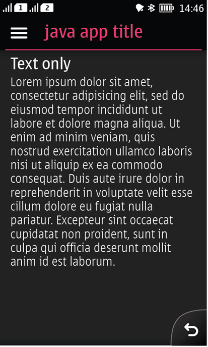
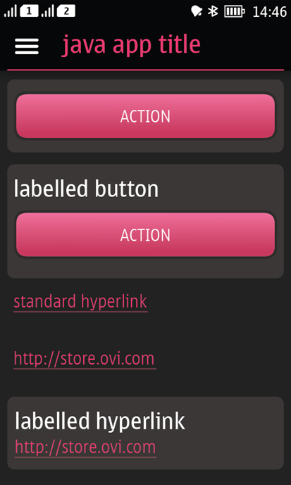
Figure 1. Text item as button, hyperlink and text  
|
StringItem type 'text':
- Label is optional.
- Can include multiple lines of text.
StringItem type 'button':- Label is optional.
- Only one button in a line.
StringItem type 'hyperlink':
- Label is optional.
- In case label is used, it is placed on top of the hyperlink.
- When part of text is defined as hyperlink, it becomes its own line, and cannot be part of larger text.
- The hyperlink can consist of multiple lines of text.
|
| TextFields |
|
|---|
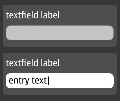
Figure 2. Text field
|
- Used for inline text entry.
- Tapping on the text entry field activates the keypad.
- The field moves to the top of the screen.
- If sufficient screen estate is available, other nearby form fields are still visible above the keypad.
- User can input texts by tapping on the keypad.
- User can hide the keypad by dragging on the keypad hide bar.
|
Note: Inline editing is referred to as a text edit within a larger document, like form or a text document. Sub-state editing is related to pop-ups and single text entry tasks.
| ChoiceGroup (exclusive choices) |
|
|---|
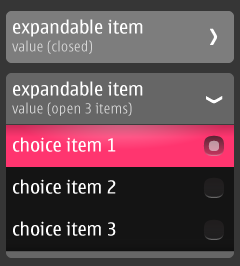
Figure 3. Expandable choice group with exclusive choices
|
- Mandatory to select always one item from the predefined list.
- In case it is possible to have "no selection", add this as an item to the list.
- The form field expands to show possible values once the field is tapped by user.
- When not expanded:
- Only the parent item is shown.
- Contains a heading line, a value line and an arrow pointing to the right.
- When expanded:
- The sub-items (with radio buttons indicating the currently active value) are shown below the title and value line.
- The arrow points downwards.
- User can change the value by tapping on the desired item. This collapses the list, and the new value is displayed under the heading line.
- Tapping again on the title/status line or on any other items in the form will collapse the list without making a change.
|
| ChoiceGroup (non-exclusive choices) |
|
|---|
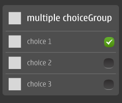
Figure 4. Choice group with non-exclusive choices
|
- Multiselection fields show available choices in a list.
- Selectable items in the list are shown with check buttons on the right, indicating the currently selected values.
- Changes are kept until the user saves the form (by pressing the tickmark icon in action button 1) .
- Changes are discarded when the user leaves the Form without saving (pressing back in the Form and pressing cancel in the confirmation alert).
|
| DateField |
|
|---|
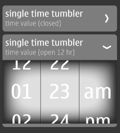
Figure 5. Time tumblers
|
- Used to set time or date.
- When collapsed:
- Only the parent item is shown.
- Parent item contains a title line, a status line, and an arrow.
- When expanded:
- Tumblers are shown (one for each part of the setting).
- User can swipe the tumbler, and then select the desired number or am/pm value.
- Tapping again on the title/status line or on any other items in the form hides the tumblers.
|
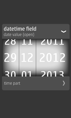
Figure 6. Date and time tumbler
|
- Date & time tumbler has the two fields combined in one component.
- They function the same way as the single field tumblers.
|
| Gauge (slider) |
|
|---|
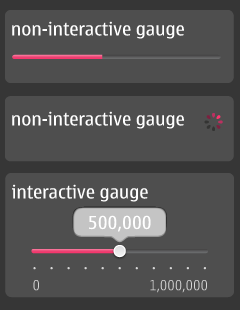
Figure 7. Gauges
|
Non-interactive gauge- Informative only; no user interaction.
- Tells the user that something is happening.
- Progress bar is used for determinate processes, i.e. when it's known how long the process will take.
- Spinner is used for non-determinate processes, i.e. when it's not known how long the process will take.
Interactive gauge
- Set a value from a continuous range.
- It is possible to drag on the slider marker to change the digital value.
- Sliders are controlled inline directly in the form.
- It is possible to type a new value by virtual keypad, which appears after tapping the current value.
- Numeric min and max values are given for the gauge.
|
ImageItem can have one of the following types:
- Image.
- Hyperlink.
- Button.
CustomItem can be used to create a custom made item to be used on the Form; custom buttons, images, special tumblers, basically anything.
Spacer is used to make more space between individual Form elements.
Ticker can be placed on the top of the view to show a text string that automatically scrolls from right to left.
