TextEditor
TextEditor is a floating text editing user
interface component that is used on top of LCDUI Canvas. TextEditor is similar to the standard
LCDUI text editing components, TextField and TextBox. However, TextEditor is implemented with minimal decoration. The client application defines
the colors for the editor and draws additional UI enhancements such
as scroll bar if needed.
In addition to standard text manipulation, TextEditor supports touch input (handwriting recognition and virtual keyboards)
on touch screen devices and selection of additional characters.
There can be multiple TextEditors on Canvas. The drawing order is based on the Z-Position of
each component.
The application is in control of the TextEditor behavior. The application can change focus, visibility, Z position,
or traverse to next/previous TextEditor by using
the TextEditor methods as a reaction on input
events, such as touch events and TextEditorListener events.
When a TextEditor is created, it has fully
transparent black background color, black foreground color, and it
is invisible, single line, unfocused and can receive pointer events.
If a MIDlet uses the TextEditor constructor without
a text parameter, the TextEditor does not affect
the MIDlet UI when set visible.
TextEditor supports input constraints identically
to TextField. See input constraints section in
the TextField for the definition of these constants.
In addition TextEditor has the same concept of
actual contents and displayed contents as TextField; these are described in the same input constraints section.
TextEditor floats on Canvas. It introduces the component CanvasGraphicsItem, which also floats on Canvas and can
be used to present custom content on top of a TextEditor. It provides the same draw capabilities as Canvas.

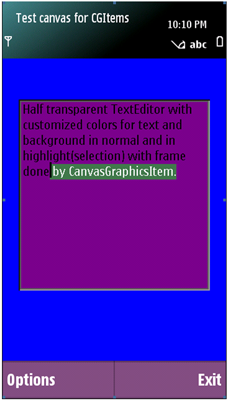
Figure: TextEditor example with selection and TextEditor example with transparency

For more information on using TextEditor,
see
For information about supported new line character combinations, see section New line handling.