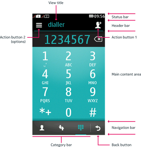
Command mapping to action buttons in the full touch UI
In the full
touch UI, the header bar is displayed below the status bar
and shows the title of the current view. The header bar contains placeholders
for two action buttons to which Commands and IconCommands can be mapped:
Action button 1 is positioned to the right of the view title and functions as the primary action button. It displays the highest-priority positive command. You can define a custom icon for the command by using an
IconCommand.Action button 2 is positioned to the left of the view title and always shows an options icon. Selecting it opens the list of remaining commands (assuming any are available).

Figure: Action buttons in the header bar
For more information about the main elements of the full touch UI, see section Full touch devices.
Command mapping for Canvas and Form elements
The following table
lists the various scenarios of how commands are mapped to the action
buttons and the Back button. The scenarios only apply to commands
added to Canvas or Form elements.
Scenario |
Action button 1 |
Action button 2 (options) |
Back button |
|---|---|---|---|
If there is only one positive command ( |
If an icon is specified, the positive command is mapped to action button 1. Note: Any positive |
If no icon is specified, the positive command is mapped to action button 2. Note: Only commands of type If there are no additional commands to display other than action button 1, action button 2 is displayed as dimmed and inactive. |
The Back button is not visible. |
If there is only one negative command ( |
Action button 1 is not visible. |
If the negative command is of type |
If the negative command is of type If there is a negative command
of type |
If there is one negative command and one positive command. |
If an icon is specified, the positive command is mapped to action button 1. |
If no icon is specified, the positive command is mapped to action button 2. Negative commands (with the exception of
a |
If the negative command is of type If there is a negative command
of type |
If more than two commands are present (positive or negative). |
If an icon is specified, the highest-priority positive command is mapped to action button 1. |
All other positive commands are mapped to action button 2. Negative commands (with the exception of a |
If the negative command is of type If there is a negative command
of type |
If there is a command of type |
The command is mapped to action button 1 and the default icon of a tick will be displayed. |
Action button 2 is displayed as dimmed and inactive. |
|
If there is only one action defined, the command type is
not |
Action button 1 is not visible. |
The command is mapped to action button 2. |
|
If there are no additional commands to display other than action button 1 and the Back button. |
Action button 1 is visible. |
Action button 2 is displayed as dimmed and inactive. |
The Back button is visible. |
Ordering of commands under action button 2
Commands within a command list are shown in the following order:
Any
STOPcommandsAny
OKcommandsAny
CANCELcommandsAny
FORM ITEMcommandsAny
SCREENcommandsAny
HELPcommandsAny
EXITcommands
UI element operations and item-specific commands are only accessible by a long tap. If there is more than one of any type of command, within each command type group placement, the individual commands are ordered according to the general rules specified above.