Series 40 touch UIs
Series 40 touch devices come in two varieties:
Touch and type devices have both a touch screen and a physical keypad. The user experience combines touch interaction with key-based interaction. For example, the user navigates the UI and selects elements using the touch screen and enters alphanumeric input using the physical keypad. These devices run Series 40 6th Edition FP1 or newer.
Full touch devices have a large touch screen and only a few mandatory physical keys. The user experience is based almost exclusively on touch interaction. For entering alphanumeric input, the UI provides a virtual keyboard on the touch screen. These devices run Java Runtime 2.0.0 for Series 40 or newer.
To determine whether a Series 40 device is a full touch device,
retrieve the value of the com.nokia.keyboard.type system property. If the value is None, the device
is a full touch device:
if (System.getProperty("com.nokia.keyboard.type").equals("None")) {
    // This is a full touch device
}
Series 40 touch UIs use single tap for interacting with UI elements. To select a UI element, the user taps it once. No separate tap is required to first focus the element. High-level LCDUI elements automatically follow this behavior. If you want to use this same behavior for low-level LCDUI elements, you need to implement it for them separately.
Touch and type devices
In a touch and type device:
The physical keypad contains the standard alphanumeric keys, call creation and call termination keys, and a few device-specific extra keys. Some devices have a QWERTY keyboard.
The navigation keys are not included, since UI navigation relies on touch interaction.
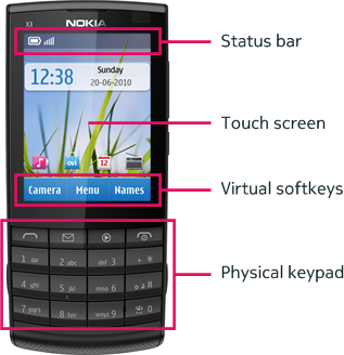
The physical softkeys are replaced by virtual softkeys shown at the bottom of the touch screen. The virtual softkeys are sized so they can be used with the thumb of the hand holding the device.
Most elements on the screen respond to touch. The only exceptions are the status bar at the top of the screen and, when shown, the scroll bar, both of which are for information purposes only and therefore non-interactive.
The following figure shows the main UI elements of a touch and type device.

Figure: Main UI elements of a touch and type device
The display resolution on a touch and type device is 240 x 320 pixels (3:4).
For more information about touch and type, see:
Series 40 Touch and Type UI Style Guide on Nokia Developer for an overview of the touch and type UI
Designing for Series 40 Touch and Type on Nokia Developer for guidelines on designing MIDlets for the touch and type UI
Full touch devices
On a full touch device, the touch screen provides the primary means of user interaction and input. The only mandatory physical keys are the call creation and call termination keys, and the keyguard switch. The device can also have a few extra keys, such as the volume key. For text input, the full touch UI provides a virtual keyboard.
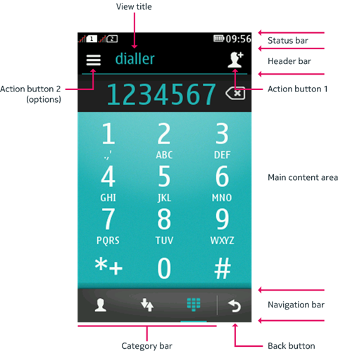
The following figure shows the main elements of the full touch UI.

Figure: Main elements of the full touch UI
Unlike the touch and type UI, the full touch UI does not include virtual softkeys. Instead, most commands are mapped to two action buttons located in the header bar:
Action button 1 is positioned to the right of the view title and functions as the primary action button. It displays the highest-priority positive command. You can define a custom icon for the command by using an
IconCommand.Action button 2 is positioned to the left of the view title and always shows an options icon. Selecting it opens the list of remaining commands (assuming any are available).
The navigation bar at the bottom of the touch screen contains
the Back button, to which either the BACK or EXIT command is mapped, and optionally a category bar for
switching between different views within the same application.
The display resolution on a full touch device is 240 x 400 pixels (3:5).
For more information about full touch, see:
Series 40 Full Touch Design Guidelines on Nokia Developer for an overview of the full touch UI and information about design guidelines you should follow when developing MIDlets for the UI
CategoryBar in this library for instructions on how to create a category bar in your MIDlet
Launching the virtual keyboard for Canvas and CustomItem in this library for instructions on how to launch a virtual keyboard for low-level UI elements on full touch devices
Command and IconCommand in this library for information about commands and how they map to the action buttons and the Back button