Date and time fields
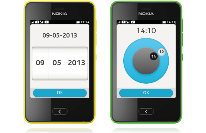
Date and time pickers enable users to select a time and a date. Select the default value in a way where the user has to do as little changes as possible, e.g. set today's date as the default if it is likely to be the desired value in most use cases. Date tumbler columns can loop (e.g., 01-12). The time picker has wheels for time, and a digital clock showing current selection.

Date picker mode

- DateField.DATE is available for Form.
- Used for setting a date.
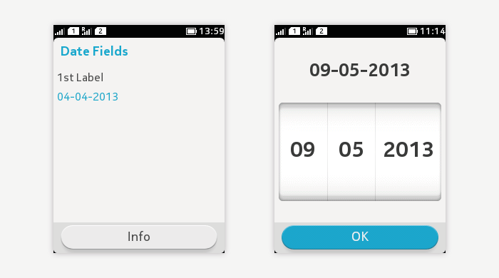
- When not opened, only the parent item is visible showing title and value.
- When opened:
- Date label at the top of the screen shows the current selection.
- The date columns are shown below the label.
- The current value is vertically centred.
- User can change the value by dragging or flicking the columns.
- Value is saved by tapping the 'OK' button.
- Pressing the back key goes back to the Form view without saving any changes.
Time picker mode

- DateField.TIME is available for Form.
- Used for setting time.
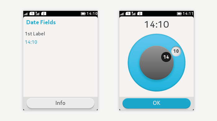
- When not opened, only the parent item is visible showing title and value.
- When opened:
- Time label at the top of the screen shows the current selection in digital format.
- The time picker wheels are shown below the label.
- The outer ring is for minute setting.
- The inner ring is for hour setting.
- The current selection is shown in the wheel labels, and also on top of the wheel in digital format.
- User can change the value by dragging the wheel label.
- Value is saved by tapping the 'OK' button.
- Pressing the back key goes back to the Form view without saving any changes.
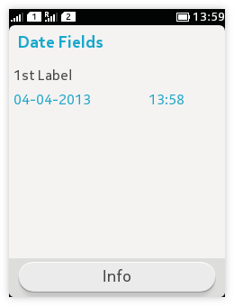
Combined date and time picker
 |
|