Forms
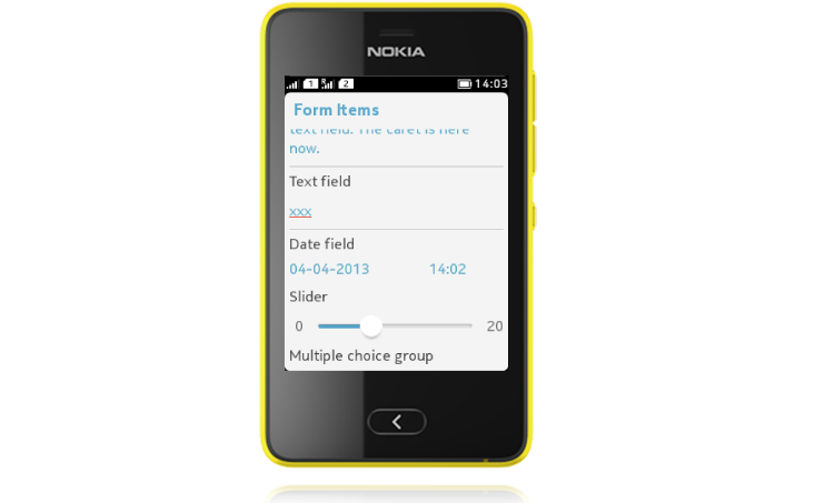
The LCDUI Form can be used for various types of application views, and is by no means restricted to be used to compile a form to collect user input. However, the ready-made Form elements support this type of task very well. All Form elements appear one after another on the view, and the view becomes scrollable if all content does not fit the screen.
ChoiceGroup
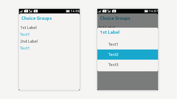
ChoiceGroup type POP-UP:
- Exclusive choices only.
- Mandatory to select always one item from the predefined list.
- In case it is possible to have "no selection", add this as an item to the list.
- The form field opens a pop-up to show possible values once the field is tapped by user.
- On Form:
- Only the parent item is shown.
- Contains a heading line and a value line.
- When opened:
- A pop-up opens with selectable items.
- Currently selected item has a highlight.
- User can change the value by tapping on the desired item. This closes the list, and the new value is displayed under the heading line of the parent item.
- Pressing Back will close the list without making a change.
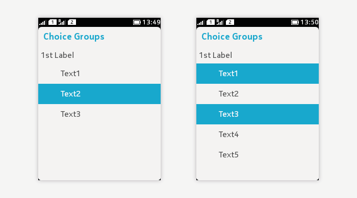
ChoiceGroup types EXCLUSIVE and MULTIPLE:
- Available choices are shown in a list.
- ChoiceGroup title is optional but highly recommended.
- Icons are optional.
- Currently selected item has highlight.
- With EXCLUSIVE list, only one item can and has to be selected.
- With MULTIPLE list, zero or more selections are possible.
- Changes are kept until the user saves the form.
- Changes are discarded when the user leaves the Form without saving.
Commands
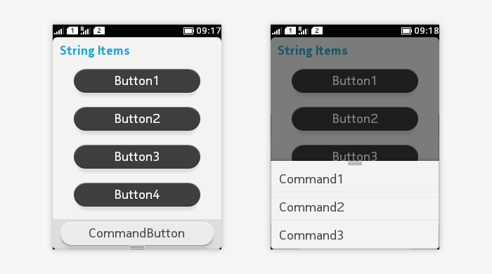
In general, Command mapping on Form follows the same rules as for other Screens.
- The highest priority Command is mapped to the bottom of the screen as a Command button.
- The rest of the Commands are mapped to the Options List.
However, if CategoryBar is used, the Command button will not be shown; all Commands will be mapped to the Options list in this case.
When using the Form to collect data from the user, there has to be a way to confirm the changes made:
- Either through the Options List (if CategoryBar is used), or
- with a suitable Command mapped to the bottom of the screen ("Done" or "Save", for example).
When the user presses Back, all changes should be discarded.
CustomItem
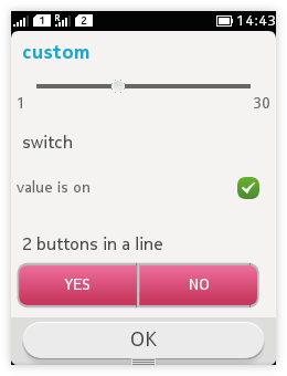 |
Please note that the shown example is a mock-up and does not exist ready made! |
DateField
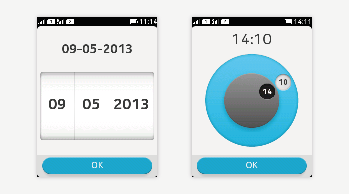
- DateField.TIME:
- For setting time.
- When not opened, the parent item is visible showing title and value.
- When opened, the value can be changed.
- DteField.DATE:
- For setting date.
- When not opened, the parent item is visible showing title and value.
- When opened, the value can be changed.
- DateField.DATE_TIME:
- For setting date and time with one component.
- When not opened, the parent item is visible showing title and values.
Gauge
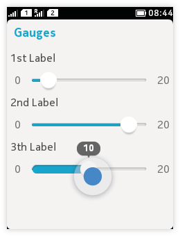 Non-interactive
- Non-interactive gauge, i.e. progress bar.
- Informative only; no user interaction.
- Used for indicating on-going process with continuously running or incrementally updating gauges.
- Interactive gauge, i.e. slider.
- Used for setting a value from a continuous range.
- The value range always starts from zero.
- The min and max values are shown at each end of the slider.
- When moving the slider handle, the current value is shown in a "bubble" above the slider.
ImageItem
 |
|
Spacer
Spacer increases the Form component area downwards.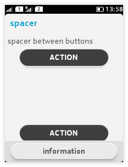
StringItem
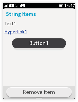 |
StringItem type PLAIN:
StringItem type BUTTON:
StringItem type HYPERLINK:
|
TextField
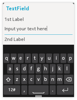
- Used for text entry.
- Tapping on the text entry field activates the keypad.
- User can input texts by tapping on the keypad.
- The field moves right above the keypad if otherwise hidden under it.
- Other Form fields are still visible above the keypad and can be scrolled.
- Edits are accepted once the keypad is closed or some other field is selected.
- Input constraints:
- ANY
- EMAILADDR
- NUMERIC
- PHONENUMBER
- URL
- DECIMAL
- Modifier flags:
- PASSWORD
- UNEDITABLE
- SENSITIVE
- NON_PREDICTIVE
- INITIAL_CAPS_WORD
- INITIAL_CAPS_SENTENCE
Ticker
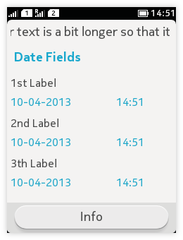 |
Used for displaying continuously scrolling text above the Displayable title. |