Buttons
There is no button component for LCDUI. However, buttons are used in some occasions: textual buttons in Alerts, on Form (StringItem type BUTTON), and as a Command button. All these "buttons" have the same size and shape, and they have text labels (no icons supported). Graphical buttons are used with the CategoryBar.
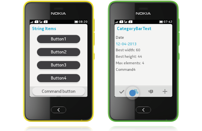
Buttons have two different states; normal and pressed down. Action is triggered with touch release. Cancelling the action can be done by dragging finger away from the button on pressed down state.
Buttons in Alerts
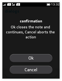 |
All Commands defined for an Alert are presented as buttons. There can be 1-3 buttons on each Alert. For more information, please refer to Dialogs (Alerts). |
Buttons on Form
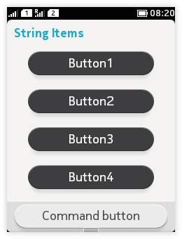 When a textual button is needed on a Form, the easiest way to implement it is by defining a SringItem to be of type BUTTON. You can place one button in each line, and when multiple buttons are defined they will appear on top of each other. For more information, please refer to Forms.
Command button at the bottom of the view
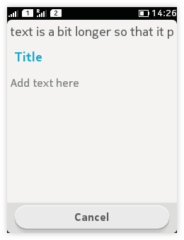 |
The Command with the highest priority will be mapped to the toolbar area as a textual button, while the other view Commands will be mapped to the Options menu. So the easiest way to define a Command button would be to have only one Command (regardless of Command type) with priority 1; that would then be shown as Command button. If multiple Commands have the same priority, the Command type priority order is as follows: ITEM, STOP, CANCEL, EXIT, BACK, HELP, OK, SCREEN. |
Graphical buttons
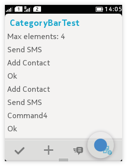 When using the CategoryBar, graphical buttons are used to indicate actions. Category bar can hold 1-4 icons for the primary actions of that view. CategoryBar is populated with IconCommands; only the icon is shown, no label. The icon gets a highlight with touch down; touch release removes the highlight and triggers the action.