Category bar
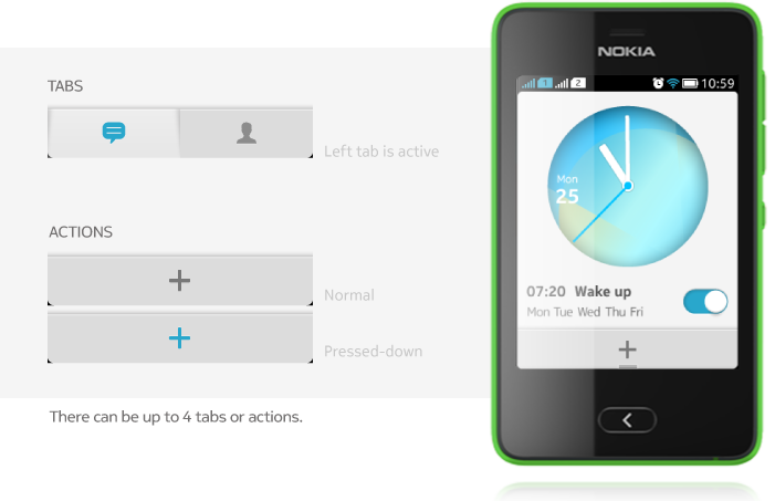
The Category bar is a horizontal bar located at the bottom of the view. It is used for providing quick access to distinct areas, modes or views or to elementary functions of an application.
It can have tabs or toolbar functionality, and can contain a maximum of 4 tabs or actions. Tabs and actions shoud not be mixed on the same category bar.

Note: Category bar cannot be customized. If your app needs customization for branding, you can implement a category bar with tabs using LWUIT Tabs. Branded category bars with actions have to be implemented as custom solutions.
Category bar with tabs

- Category bar with tabs is used for providing visibility and quick navigation to:
- Different areas of an application;
- Different modes of an application;
- Different views of an application.
- Category bas with tabs is level contextual; it should disappear when the user drills down, or be replaced with a new category bar.
- Category bar always appears at the bottom of the screen.
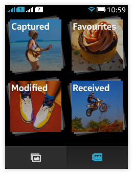
- Users change the active category by tapping on the category icon.
- The currently active category is highlighted.
- Selecting a category takes the user to the top level of that particular category.
- Pressing back key does not switch between categories.
- If the user has been tapping on differen categories, and then presses on the back key, the view with categories is exited.
- When the application is launched, it can open either the top level of the most recently used category or top level of a default category.
- Horizontal scrolling should not be used in views with a category bar; the primary scrolling direction is vertical.
- Category bar is sticky:
- When the content is moved, the category bar doesn't move with the content.
- If the application has full screen mode, the category bar is hidden when full screen mode is activated and it appears back when full screen mode is deactivated.
- In cases where there can be a lot of application content, e.g. in lists, it is possible to temporarily make the category bar disappear while the user is fast scrolling the content.
- Category bar can contain maximum 4 tabs, tabs can only have icons.
Category bar with actions

- Category bar with actions provides an easy and consistent access to all primary actions for applications views.
- It should be used for actions that should not be hidden when scrolling.
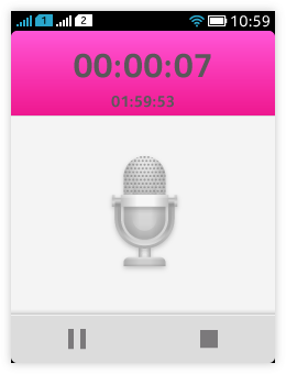
- It can contain maximum 4 iconic action buttons (no label text for actions)
- The action buttons represent functions or toggles. Tapping the icon starts executing the assigned action.
- All empty slots on the Category bar don't need to be used.
- Only the most important actions should be placed on the Category bar (as IconCommands), the rest should be placed in the Options menu (as Commands).
- The order of actions on the Category bar should be based on priority.
- The left-most item is the first one in priority order.
- To achieve consistency and to help users to find certain types of actions in similar positions, note that:
- "Add new" actions should be placed as the left-most item.
- "Edit" action should be placed as left-most item (if "Add new" and "Edit" exist in the same view, "Add new" is the left-most item and "Edit" is placed next to it).
- "Delete" action should be placed as right-most item.
- "Share" should be placed to the left of the "Delete" item.
Note: "Back" and "Options" should never appear as actions on Category bar.