Headers and dividers
Headers and dividers are used to display a title for the current view or group and/or structure the information on the display to make it easier to understand which items belong together. There are 3 types of headers: Header Bar, Group Header and Label.
All headers are optional and not applied by default. To save display space, headers should be used only when content of the application/view/group might not be self-evident to the user.
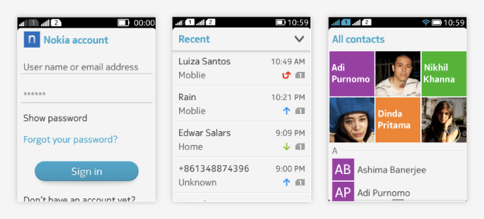
Header bar
Informative header bar
- Located below the status bar.
- Can contain text and thumbnail.
- Offers no interaction.
- Only one header bar per view.
- Can be implemented by:
- Using the platform Header bar, or
- Using LWUIT TitleArea (part of Form) styled to the platform theme (this solution allows to dim or remove the Header bar when needed).
- Behavior:
- platform Header bar: is sticky
- LWUIT TitleArea: application can decide whether the header bar is sticky or whether it scrolls away with the content.
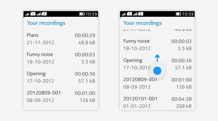
Interactive header bar
- Not supported as an off-the-shelf LWUIT component, but you can create a custom interactive header bar using LWUIT Form title on fullscreen canvas.
- It is suitable for branding.
- Icons are supported.
- Possible to add action button on interactive header bar, e.g. for filtering or search.
- Usage & behavior:
- Interactive header bar is sticky and stays on the screen even when the content below it is panned.
- Can be tapped to execute a function.
- The whole bar can be a tappable area, or
- If there is an action button, then that is the tappable area.
Below is an example of custom interactive header bar and of header bar with filtering action button.
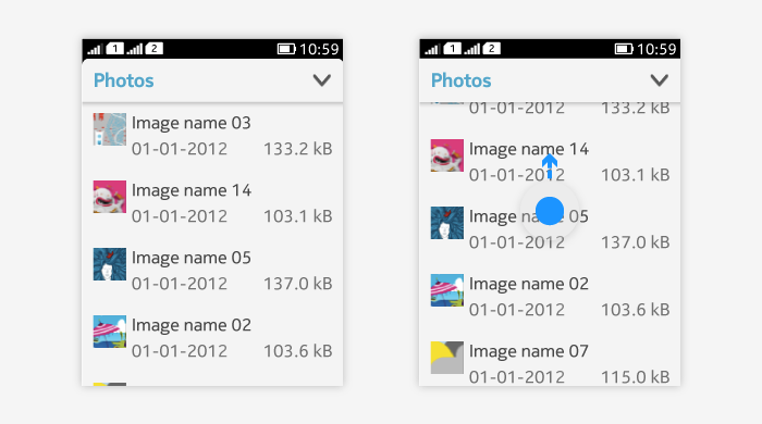
Group header
- Can be used to separate application content into groups.
- Typically only text title of the group.
- Non-interactive.
- Scrolls with content.
- Usually alinged to the left hand side. Can be right aligned when using time stamp.
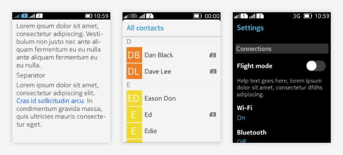
Label
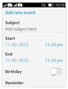
- Can be used for single items to give it a title that clarifies its usage to the end user.
- Labels are used e.g. in forms for different fields.
- Label usage is optional in form.