Pickers
Pickers are used to select values, such as time or date, or selecting content. They help to provide simple and fast ways to select content in the application and are typically used in settings or forms. Pickers are not full screen – they show status bar like normal UI states.
Following pickers are available:
- Tumblers (Spinner).
- Calendar.
- DatePicker.
- TimePicker.
- UnitPicker.
- Single choice picker (ComboBox).
- Choice picker.
- Multichoice picker.
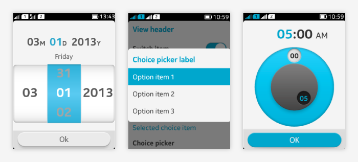
Pickers are closed by:
- Tapping on the confirm button, or
- Pressing the back key, or
- Completing a single selection in the picker.
Spinner
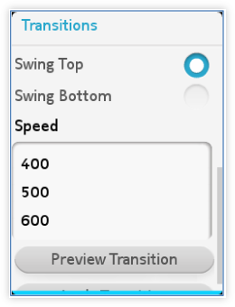 Offers a simple and fast way to select values. Consists of:
- Title (non-interactive).
- Tumbler wheel (one or more spinners can be placed next to each other).
- Button (optional).
Usage:
- If the spinner is used within a form, no explicit confirmation is needed, the selected value is automatically saved.
- If the spinner opens in a view of its own, a confirmation button can be used.
Image on the right shows an example of LWUIT spinner (unstyled).
Calendar
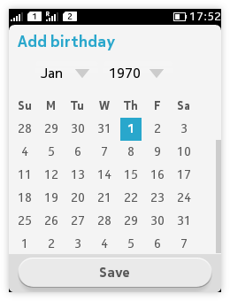 |
Offers a simple way to set dates. Consists of:
|
Note: Calendar is LWUIT's own component. In order to be aligned with the platform's look-and-feel, it is recommended to use the DatePicker for selecting dates.
DatePicker
A general component to set the date. It follows the phone date format.
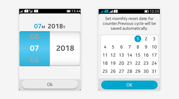
DatePicker consists of:
- View header (optional).
- Help text (optional).
- Date label.
- Non-interactive.
- Shows the currently selected date.
- The corresponding part of the date label is highlighted when the user interacts with the date tumbler.
- Date tumbler.
- Has 2/3 columns for day, month, and year selections.
- The day column is removed when the date picker is used for selecting a month only and the day value is not relevant for the selection.
- If the picker is used only to pick a day, use the grid view – it is more efficient than the tumbler.
- The day column has 28 to 31 items and is dynamic according to which month and year are currently selected.
- Toolbar with "OK" button.
Usage:
- Tapping and flicking vertically on any column can adjust the column selection. Releasing finger completes the selection.
- Tapping on the "OK" button saves the selection, closes the picker and goes back to the previous view.
- Pressing the back key closes the picker without saving any changes and goes back to the previous view.
TimePicker
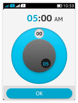 Offers a simple way to select the time. It follows the phone time format.
TimePicker consists of:
- View header (optional).
- Digital clock.
- Non-interactive.
- Shows the currently selected time.
- The corresponding part of the digital clock is highlighted when the user interacts with the time picker wheel.
- AM/PM label is shown in the digital clock when 12 hours format is selected, changing between AM and PM when the hour handle reaches 0 point.
- Time picker wheel.
- Has two rings. Each ring has a handler that shows the currently selected value as a label.
- The outer ring is for minute setting, it has 60 tracks, one per each minute.
- The inner ring is for hour setting, it has 12 tracks.
- Toolbar with "OK" button.
Usage:
- Tapping on or dragging the handlers adjusts the time. Dragging clockwise increases the value, anticlockwise decreases the value.
- Releasing the finger stops adjusting.
- Tapping on the "OK" button on toolbar saves the time setting, closes the picker and goes back to the previous view.
- Pressing the back key closes the picker discarding all changes, closes the picker and goes back to the previous view.
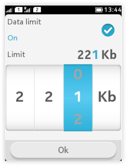
UnitPicker
 |
|
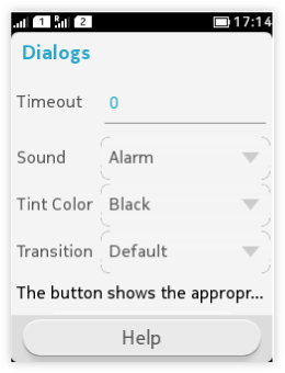
Single choice picker (ComboBox)
ComboBox is a list that allows only one selection at a time.
|
 |
Note: An alternative way of allowing users to make single selections are Exclusive lists (Single selection lists), see example below.
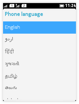
Choice picker
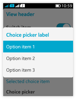 |
Choice picker is a suitable way of presenting selections when available space is limited or more than few options are available.
|
Multichoice picker
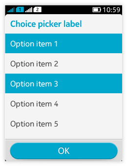
- For making one or more selection at one time.
- Consists of selection labels and choice items.
- Tapping on a specific item selects the item.
- Selected items are highlighted in the picker.
- Tapping on a highlighted item unselects the item.
- Tapping on the confirm button saves all choices, closes the picker and goes back to the previous view.
- Pressing the back key dismisses all selection changes, closes the picker and goes back to the previous view.