Selecting the right UI library
When you are designing your application, you can select from high level UI components or low level UI components (canvas).
High-level UI elements use the native touch implementation provided by the device, so you do not need to separately program touch interaction for them. Low-level UI elements, however, do not automatically implement touch functionality, so you need to separately listen for and handle touch events for these elements.
High-level UI components
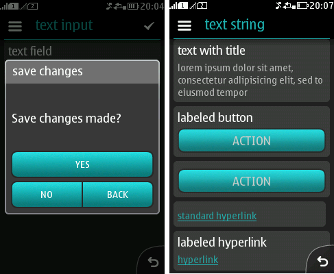
LCDUI is a solid UI framework familiar to most Java ME developers. It provides a compact selection of basic high-level UI components that provide a pre-defined look and feel of the Series 40 platform style. You can use components of the Nokia UI API together with the LCDUI components. High-level UI is a good choice when platform look and feel is crucial and the easiness of the development and robustness of the UI is more important than impressive effects or application branding. When you are using high-level components, the platform takes care of drawing, fonts, and keypad and touch handling when scrolling and selecting items. Because of this, high-level UI components are highly portable.

Figure: High-level UI components
The high-level APIs are:
- Alert
- Form (with ChoiceGroup, DateField, TextField, StringItem, ImageItem, Gauge, Spacer, CustomItem)
- List
- TextBox
The selection of LCDUI components is pretty limited and they are generally not customisable. In order to provide custom elements on an otherwise high-level user interface, you can have a CustomItem on Form. Or they can have applications with separate high-level and low-level views. Examples of typical applications with high-level UI components are productivity applications (converters, calculators, to-do lists) and applications relying on a form-based structure (flight/hotel search guides). Also custom applications may utilise high-level components in their settings view.
Low-level UI components (canvas)
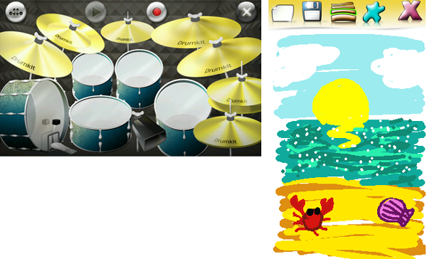
LCDUI also contains Canvas, a low-level API that gives you an experience to control graphic elements and customise features. When you use low-level components, you are responsible for supporting different input mechanisms and scaling the UI on different screen resolutions and orientations to make the application portable. Creation of custom UIs is considered more time consuming and difficult than high-level UI components.

Figure: Low-level UI components (canvas)
The low-level APIs are:
Examples of typical applications with low-level UI are games, multimedia applications, and branded applications.
In addition to the options mentioned above, you can opt for designing the UI with the Lightweight User Interface Toolkit (LWUIT). For more information, see LWUIT.