List
List is a user interface component that
occupies the whole main pane of the screen and allows the user to select one
or multiple items from a predefined set. The List layout varies based on four attributes:
list type
optional icon attached to the elements
font
fit policy for long elements
When a List becomes the foreground Displayable, the currently selected List element becomes automatically focused. On touch devices
a List item is highlighted in the press down state and selected in
the released state. Row elements are composed of a text part, an optional
icon and an optional font attribute. A List is
almost similar to the Form component ChoiceGroup and they both have a common Choice interface.
Lists come in three different configurations: IMPLICIT, MULTIPLE and EXCLUSIVE. A common usage for a List is a MIDlet main menu.

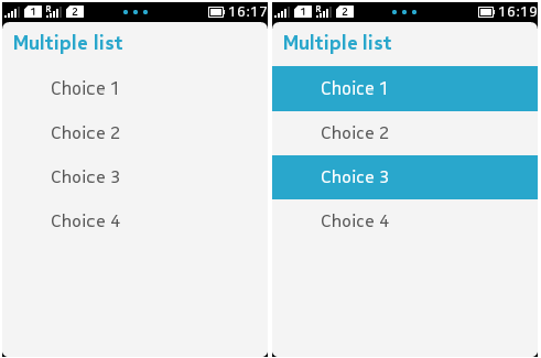
Figure: A simple MULTIPLE List
Source code for the example:
import javax.microedition.midlet.*;
import javax.microedition.lcdui.*;

public class ExampleList extends MIDlet implements CommandListener {
    private List ls;
    private Command exit;

    public ExampleList() {
        //List(label,type,items,Images)
        ls = new List("Multiple list", List.MULTIPLE, new String[] {"Choice 1", "Choice 2", "Choice 3", "Choice 4"}, null);
        exit = new Command("Exit", Command.EXIT, 1);
        ls.addCommand(exit);
        ls.setCommandListener(this);
    }
    public void startApp() {
        Display display=Display.getDisplay(this);
        display.setCurrent(ls);
    }
    public void pauseApp() {
    }
    public void destroyApp(boolean unconditional) {
    }
    public void commandAction(Command command, Displayable displayable) {
        if (command == exit) {
            destroyApp(false);
            notifyDestroyed();
        }
    }
}
When List becomes the foreground Displayable, the first List element
becomes automatically focused on non-touch devices.
Default font face (FACE_SYSTEM) is always used.
The Font property of element can be set independently
from the other elements in the same List. The
default font used in elements is the same as returned by Font.getDefaultFont().
Lists with no data are presented so that the user clearly sees
that they are empty, a no data or empty text is displayed in the user interface. On Nokia Asha software
platform devices no text is displayed. It is not possible for the
user to trigger a SELECT_COMMAND, or select Command (MIDP 2.1) notification in an empty IMPLICIT List.
For information about supported new line character combinations
in List element text, see section New line handling.
Touching down and releasing a
Listitem changes only the selection, since no separate focusing is required.For
IMPLICIT Lists, the select command is activated on the first touch down and release. In addition, the select command label is never shown.If a list item has multiple commands assigned to it, touching down and holding the item opens a pop-up menu containing the commands. The pop-up menu corresponds to the context-specific Option's menu of non-touch devices.
No focus highlight is shown while scrolling the list by dragging or flicking.
Listitems do not have a permanent highlight, since UI elements are not focused separately. Instead, a list item is briefly highlighted when tapped, that is, the item is highlighted on touch down and the highlight disappears on touch release.A scrollbar is shown only when the list needs scrolling. The scrollbar is informational only and therefore non-interactive. Dragging or flicking the list scrolls it. The scrollbar is self-dismissible on Series 40 full touch and Nokia Asha software platform devices.
Fit policy
Fit policy defines how the text is laid out in a List. The initial value of the element fit policy is TEXT_WRAP_DEFAULT. The size of Images determines whether the default fit policy is TEXT_WRAP_ON or TEXT_WRAP_OFF as follows:
If the element image fits into one row, the fit policy is
TEXT_WRAP_OFF.If the element image height is greater than one text line, the fit policy is
TEXT_WRAP_ON.
The same fit policy is applied to all elements of a List.
Application programmer can override the default
functionality. If the fit policy is set to TEXT_WRAP_OFF, only one row is reserved for the text part regardless of the size
of the image or the length of the text. If the fit policy is set to TEXT_WRAP_ON, two rows are reserved for the text part
regardless of the size of the image or the length of the text.
Wrapping text to more than two lines is not possible. This implies that if the text does not fit into two lines, it is truncated regardless of the fit policy.
List layout
The following parameters are used to determine the List layout:
Whether there is a selection graphic (
EXCLUSIVE,MULTIPLE) or not (IMPLICIT);Whether there are images, and what is the image size; and
Whether the text needs one or two lines.
Also the following principles are applied:
It is assumed that all the
Images inListhave the same size, so the biggestImagedetermines the reserved space. There are two possible values: bigImages and smallImages. IfImages are larger than the space reserved for them, they are clipped.The text can wrap to two lines. If any of the
Choiceelements require wrapping, all elements have two lines; otherwise the size of the icons determines the height of an element.If the text does not fit into one or two lines as defined by fit policy, it is truncated, and in which case an ellipsis is used to indicate this. If the MIDlet adds or removes elements, re-layout can happen.
For information on List implementation
in Touch UI -enabled devices, see section Displayables and Commands.
For an example on using List, see article Using List in Java ME in the Nokia Developer
Wiki.
More Information
For more information about Lists see: