Form
If a MIDlet requires having multiple UI components on the screen at the same time, they can be implemented using Form s. In a similar way to other high-level APIs, Forms also take up the whole display area but in that area they can contain a number of different UI elements, such as sliders, pop-up lists and text fields. Forms offer a way to handle data and user input in a more complex way.
All Form elements are derived from the superclass Item . The Form Items are presented in the main pane, which can be scrolled vertically if all the components do not fit otherwise. Text is wrapped and images are clipped if the content exceeds the horizontal space. Items are laid out to the main pane from top to bottom and left to right, by default. An Item is focused when the user has navigated to it using the arrow keys and a highlight box indicates the Item has been focused on. Items can be editable or non-editable. On touch and type or full touch devices, a simple tap on the item highlights the item as long as the item is pressed, while releasing the item generates the action associated with it. Items can be editable or non-editable. All Items have a label, which is null by default. If an item has a label, it is displayed on a line below the rest of the item.
All editing in a Form takes place inline and all editable Items are focusable. Also the non-editable Items StringItem and ImageItem can be focusable if there are one or more Commands set to them and ItemCommandListener is registered. CustomItem is focusable if its traverse method returns true.
In Form navigation, the Arrow up and Arrow down keys move the focus, scroll form, or do both. The key behavior (the Selection key, the Arrow left and Arrow right keys) on a focused item varies from component to component. Form navigation, on touch and type or full touch devices, is implemented automatically by the platform through detecting the flick gesture. which translated to the appropriate form move up or move down actions depending on the direction of the flick. Form navigation does not loop.
Forms can contain the following Items:
Empty Forms (Forms with no Items) are presented with the text no data or empty. On Nokia Asha software platform devices, no text is appended in an empty Form.
The layout of Items within a Form is organised around rows. The maximum width of all rows within a Form is the same and does not vary based on the Items contained within the Form. If a Form exceeds the height of the screen it grows vertically and vertical scrolling is used by the user to view further content. If the content exceeds the screen width, it is either wrapped (text) or cropped (images) to the available space.
The height of the rows can vary depending on the Items positioned in the row. If the first / last Item in a Form is a Spacer larger than the size of the screen then as much of the Spacer as necessary is ignored in order to start or end the Form with the first or last visible Item being completely in view.
Focus traversal and editing
|
Item |
Key event |
Behavior |
|---|---|---|
|
TextField |
Up, down, left, right arrow keys |
Moves cursor in editor.
|
|
Interactive Gauge |
Left, right arrow keys |
Modifies Gauge value. |
|
Interactive Gauge |
Up, down keys |
Does focus traversal out of the Item. |
|
DateField |
Left, right arrow keys |
Changes between DateField subfields (switches between minute, hour, day, month, or year subfields if available).
|
|
DateField |
Up, down keys |
Does focus traversal out of the Item.
|
|
ChoiceGroup |
Left, right arrow keys |
Do not move focus at all. |
|
ChoiceGroup |
Up, down arrow keys |
Moves focus inside the ChoiceGroup between the elements or if focus is in the first or last element, then moves focus out of the Item. |
For information about supported new line character combinations, see section New line handling.
Setting the editing style for Form Items
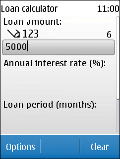
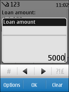
On Series 40 touch and type devices, by default, when the user taps an editable Form Item , the MIDlet UI activates the item for in-line editing. However, on Series 40 6th Edition Feature Pack 1 touch devices, the equivalent native UI elements use a pop-up ("substate") window for editing the content.


Figure: TextField being edited in-line (left) and in a pop-up window (right)
In practice, this means that the following Form Items have native UI counterparts on Series 40 6th Edition Feature Pack 1 devices that use a pop-up window for editing:
You can switch the editing style for these Form Items by using the LCDUIUtil.setObjectTrait method. If you try to set the editing style for an editable Form Item that does not have a native UI counterpart, such as DateField of type DATE_TIME, the method call is ignored. This feature is supported since Series 40 6th Edition Feature Pack 1 up until Series 40 Developer Platform 1.1.
To use a pop-up window for editing:
-
Import the LCDUIUtil class:
import com.nokia.mid.ui.LCDUIUtil;
-
Create the Form Item whose editing style you want to align with the native UI, and set the editing style using the setObjectTrait method:
// Create the Form Item (in this case, a DateField of type DATE)
DateField dateField = new DateField("Date", DateField.DATE);

// Set the editing style to pop-up
LCDUIUtil.setObjectTrait(dateField, "nokia.ui.s40.item.substate", Boolean.TRUE);
To set the editing style back to in-line, use the same method call, but set the third parameter to Boolean(false):
LCDUIUtil.setObjectTrait(dateField, "nokia.ui.s40.item.substate", Boolean.FALSE);
To query the editing style used by a Form Item, use the LCDUIUtil.getObjectTrait method:
// Check whether or not a pop-up window is used for editing
Object traitValue = LCDUIUtil.getObjectTrait(dateField, "nokia.ui.s40.item.substate");

// Extract the boolean value from the returned Object:
// If true, a pop-up window is used
// If false, in-line editing is used
boolean popupUsed = ((Boolean)traitValue).booleanValue();
Touch Interaction in Form and Form items
-
On touch enabled devices, you need not to separately highlight or focus any items appended to a Form, prior to activating them. Tapping directly the item, activates it.
-
Touch down and release on an editable field, such as a TextField or DateField, activates the field for editing:
-
On Series 40 touch and type devices, by default, tapping a TextField activates in-line editing. You can edit the value directly through the physical keypad.
-
On Series 40 full touch and Nokia Asha software platform devices, tapping a TextField automatically launches the VirtualKeyboard.
-
Touch down and release within the selected TextField moves the cursor to the point within the TextField where the tap was performed.
On Series 40 touch and type, touch down and release within the selected DateField moves the focus to the next subfield, which is not necessarily the one you tapped. Repeated taps anywhere within the DateField loop the focus through the available subfields. You cannot directly select a specific subfield by tapping it. On Series 40 full touch and Nokia Asha software platform devices, touch down and release within the selected DateField launches the DateField’s edit view. You can modify the values separately for each field in the DateField's edit view, by using the drag or flick gesture.
-
-
If an Item has multiple commands assigned to it, touch down and hold on the Item to open a pop-up menu which contains the commands. The pop-up menu corresponds to the context-specific Option's menu of non-touch devices.
If the default command has been set to an EXCLUSIVE ChoiceGroup , touch down and release on the selected EXCLUSIVE ChoiceGroup element to activate the default command.
-
If the default command has been set to a StringItem or ImageItem, touch down and release on the focused item activates the default command.
-
Form receives the drag events. The only exception is horizontal drag events on a Gauge , which is received by the corresponding element. Also horizontal drag events on a TextField on Series 40 full touch, and vertical drag on a DateField, are received by the item component, not the Form.
Gauge values can be changed by dragging the thumb across the slider. You can also change the Gauge value by tapping the slider or by entering a new value using the physical keypad for touch and type devices.
-
Dragging or flicking Form content cancels all activation arming, such as command activation.
Form supports a scrollbar. A scrollbar is shown only when the content needs scrolling. The scrollbar is informational only and therefore non-interactive. Dragging or flicking the content scrolls it. The scroll bar is self-dismissible on Series 40 full touch and Nokia Asha software platform devices.
CustomItem works much like Canvas . You can use the CustomItem.getInteractionModes method to check whether touch is supported. Touch events are sent to the MIDlet, so you can implement internal focus traversal to interact with the events.
More information
For more information about Form see: