Scalability
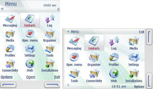
Mobile devices have several display resolutions. The trend towards larger resolutions and also different resolutions within one device (for example portrait and landscape modes in a device) may pose compatibility and performance problems with the MIDlets designed for the earlier fixed and smaller resolutions. The term scalability refers to the ability of an application UI to function as designed in mobile devices with different screen resolutions or orientations. For example, in the figure below, the UI scales to fit both portrait and landscape orientations.
In MIDP applications, high-level UI components are scaled automatically.
Although, if MIDlets set the preferred sizes for Form items,
they may also need to be scaled with resolution changes. Device implementation
gives notification (calls the Displayable.sizeChanged method)
when the drawable area changes.
Low-level UI components require more developer input to scale properly.
It is possible to adapt the MIDlet to the device resolution within implementation
using the getWidth() and getHeight() methods.
Other way is to use S60-specific JAD attributes Nokia-MIDlet-Original-Display-Size and Nokia-MIDlet-Target-Display-Size.
A general rule of thumb is that the greater the degree of customization in
your application, the more you need to handle scalability issues in the application.
Usually, an individual MIDlet does not change the default display orientation. The orientation change is a system-level event, and it is usually triggered by a hardware-dependent action, such as turning the display 90 degrees or opening the device keyboard. On some devices, the location of softkeys can change with display orientation as seen in the above figure.
For more information on scaling, see section Scaling.
