Styling individual components with Style Object
The Style object sets colours, fonts, transparency, margin, padding, images, and borders to define the style for a given component. Each Component contains a selected Style Object and allows Style modification at runtime using component.getSelectedStyle() and component.getUnselectedStyle(). The style is also used in Theming. When a Theme is changed, the Style objects are updated automatically.
Certain style methods, like applying a custom Background Color programmatically on certain components like Labels and Buttons, will not override the Nokia theme's color. In these cases, you can make the style changes to the theme file.
Color
Each Component has two adjustable colours:
|
Foreground color |
The component foreground colour that usually refers to the component text colour. For example, for a Button it is the text colour. |
|
Background color |
The component background colour. |
The color specification is RGB. There is no alpha channel within the colour (the background transparency is separate).
Valid values are integers ranging from 0x000000 to 0xffffff (black to white respectively) or a decimal number.
Font
Fonts are set with the Font object (see the Font API.) Lightweight UI Toolkit supports both Bitmap fonts and system fonts, similar to common MIDP fonts. For more information on fonts, see Fonts.
Transparency
Lightweight UI Toolkit style supports background component transparency, to add flexibility and appeal to the UI. To set a component transparency level, call setBgTransparency and specify an integer or a byte. The integer value must range between 0 to 255, where 255 (the default) is opaque.
Margin and padding
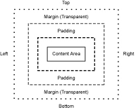
Margin and Padding are inspired by the CSS Box Model. Each component has a main content area (for example, text or icon) and optional surrounding padding and margin areas. The size of each area is specified by four integers that represent the top, bottom, left and right space (similar to component Insets terminology in SWING). The following diagram shows the placement of the areas in relation to the component content area:

Figure: Padding and margin relationships
Padding and margins can be set as follows:
// Setting padding with positive values
setPadding(int top, int bottom, int left, int right)

// orientation can be Component.TOP, BOTTOM, LEFT or RIGHT
setPadding(int orientation, int gap)

// Setting margin with positive values
setMargin(int top, int bottom, int left, int right)

// orientation can be Component.TOP, BOTTOM, LEFT or RIGHT
setMargin(int orientation, int gap)
Images
In Style, Images refer to a component background image. By default components do not have a background image, so the bgImage parameter is null by default. For more details about images, please refer to Image resources.