Text area and text field
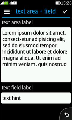
Summary:

  • Text area and text field can both be editable or non-editable.

  • Text field has fewer editing features than text area.

  • Look-and-feel for both is nowadays identical.

  • Both:

    • Use Nokia's TextEditor nowadays.

    • Can have default text.

    • Can have dimmed help text in the text field.

  • On older devices, text field uses the original LWUIT in-place text editor.

LWUIT

Related design guidelines

Basics and formats

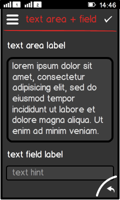
Figure: Text area and text field

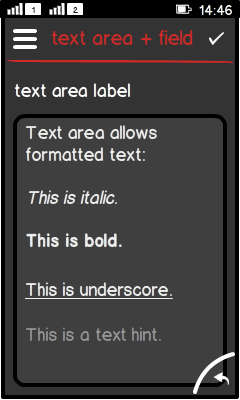
Figure: Rich text formatting

  • Text area and text field can be used for:

    • Displaying text.

    • Editing text.

    • Filling information into a form or setting.

  • Rich text editing is possible in both text area and text field.

  • Standard font in both should be Nokia Sans regular, 16 - 20pt. 14pt can be used as an exception, but only for displaying text, not for editing purposes.

  • Both text area and text field use Nokia's TextEditor. TextEditor:

    • Opens full screen editor in landscape.

    • Opens inline editor in portrait.

    • Can have default text.

    • Can have hint text; this disappears as soon as the user starts typing in the text editor.

  • Limitations:

    • Editable text area or text field could always have a non-editable state as well.

    • In case the text area or text field is used together with other UI components in one view:

      • Non-editable state should be used in this view.

      • User must activate editable state.

  • Formats:

    • Text field is a subclass of text area.

Platform specific features

Full touch

Touch and type

Non-touch

Descriptions

Figure: View in full touch

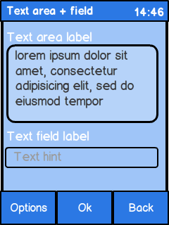
Figure: View in touch and type

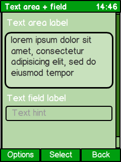
Figure: View in non-touch

  • Full touch and touch and type:

    • Embedded links require:

      • Their own line.

      • Extra space between the next lines.

  • Non-touch:

    • Do not place any UI elements inside the text field or text area (e.g., no "clear all"), since the navigation will not work satisfyingly.